Overview
Client: Meow is an enterprise fintech platform managing billions in assets. They've helped clients like Trail of Bits unlock six-figure interest by serving as their primary banking platform.
Industry: B2B fintech
Timeline: 3 months
My Role: Sole web & visual designer. This was during my tenure as a Sr. Designer at Webstacks.
Tools: Figma, Dato CMS
Results
Redesigned site drove enterprise acquisition, like Trail of Bits
Strengthened competitive positioning in sales conversations
Improved SEO through new information architecture
Challenge
Our agency was brought on to solve:
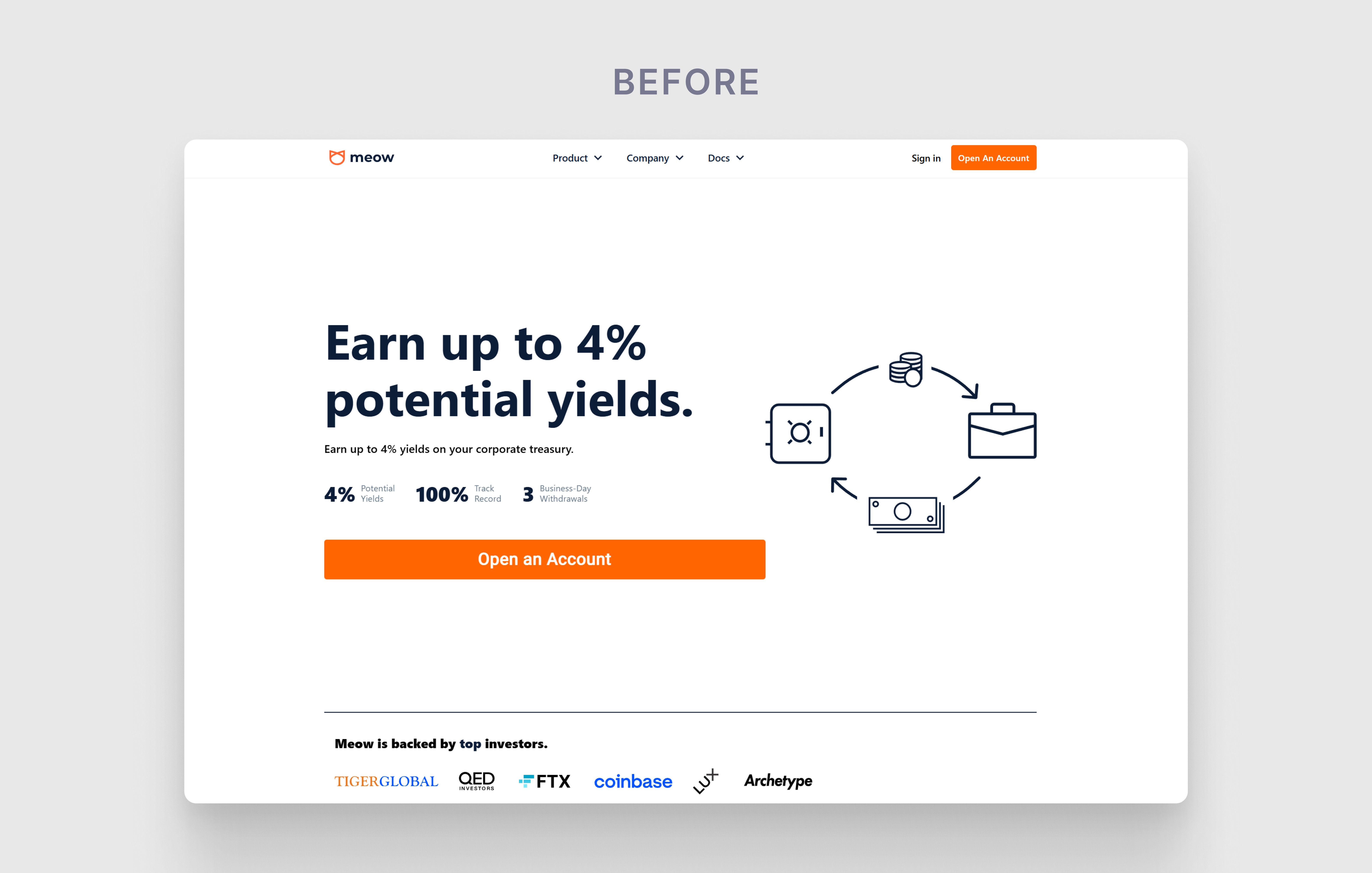
Immature visual language that didn't resonate with enterprises
Lack of illustrations that conveys what Meow offers
Slow site load times
For finance teams evaluating treasury solutions, the site lacked the credibility signals that enterprise buyers expect: no visible product UI, limited trust indicators, and positioning that didn't differentiate Meow.
Resolution
I redesigned the website to position Meow as enterprise-grade financial infrastructure.
By showing the product, proving compliance, and demonstrating customer trust upfront, the redesign removed friction from the evaluation process and positioned Meow as a serious contender for their business.
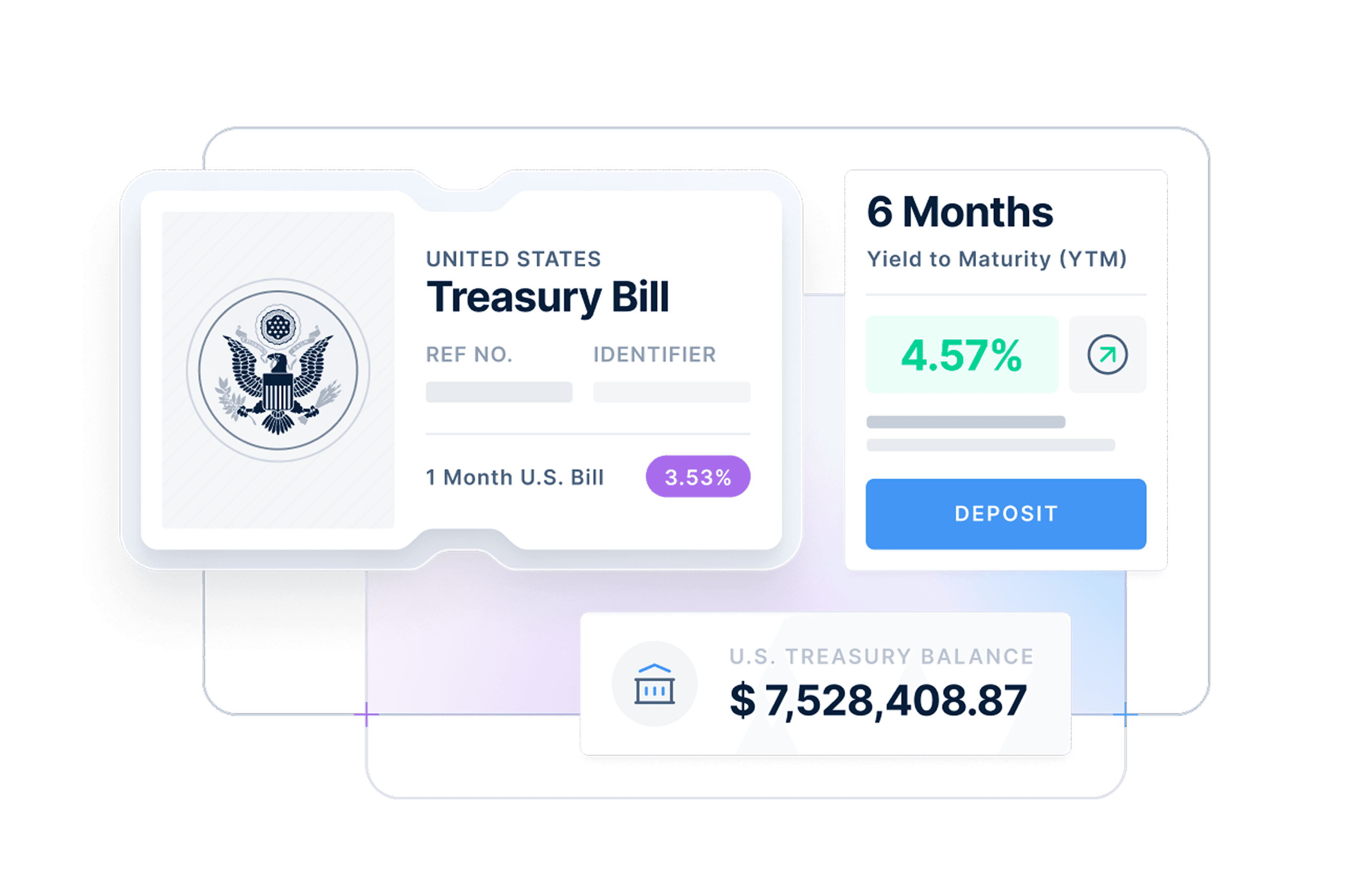
Illustrations
Instead of abstract illustrations, I showcased actual product UI elements so CFOs could see the platform.
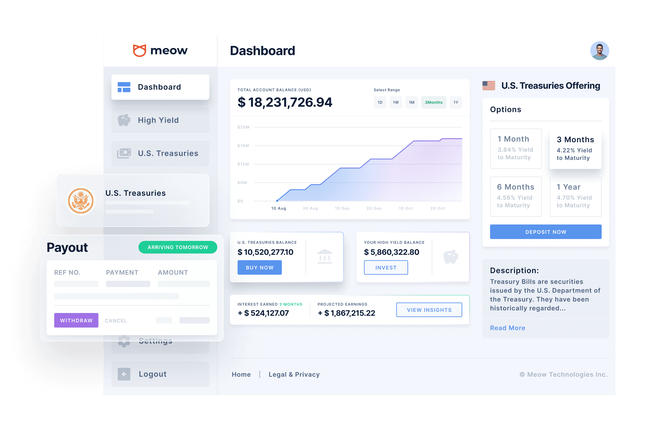
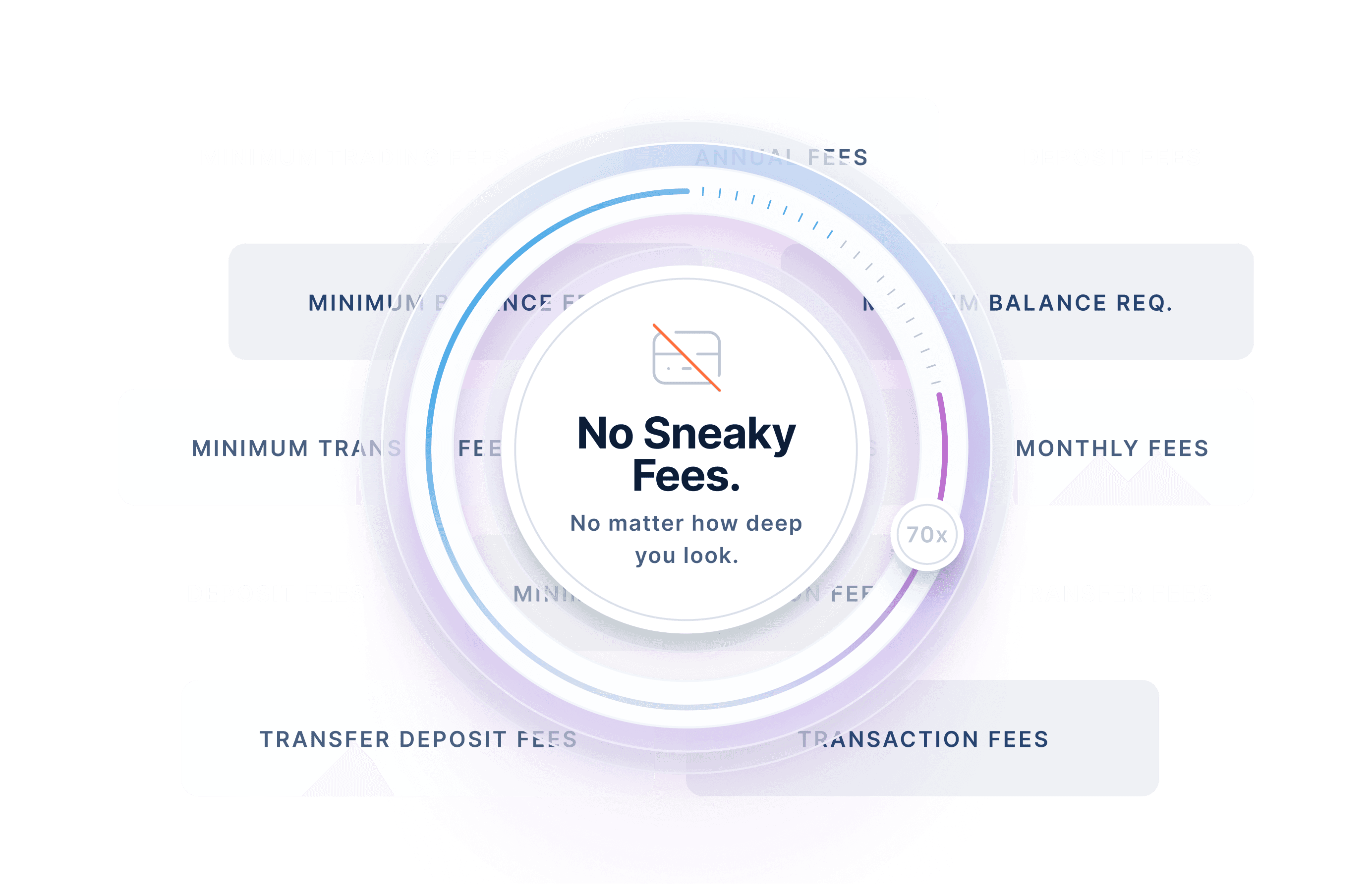
Where abstract visuals were needed, I kept them minimal yet informational.
Blog redesign
I designed Meow's blog to improve SEO, generate leads, and establish thought leadership with finance execs.
The blog became a key asset in Meow's enterprise sales motion.
Collaboration
Towards the end of the project, tensions were high as both of our teams were in crunch time.
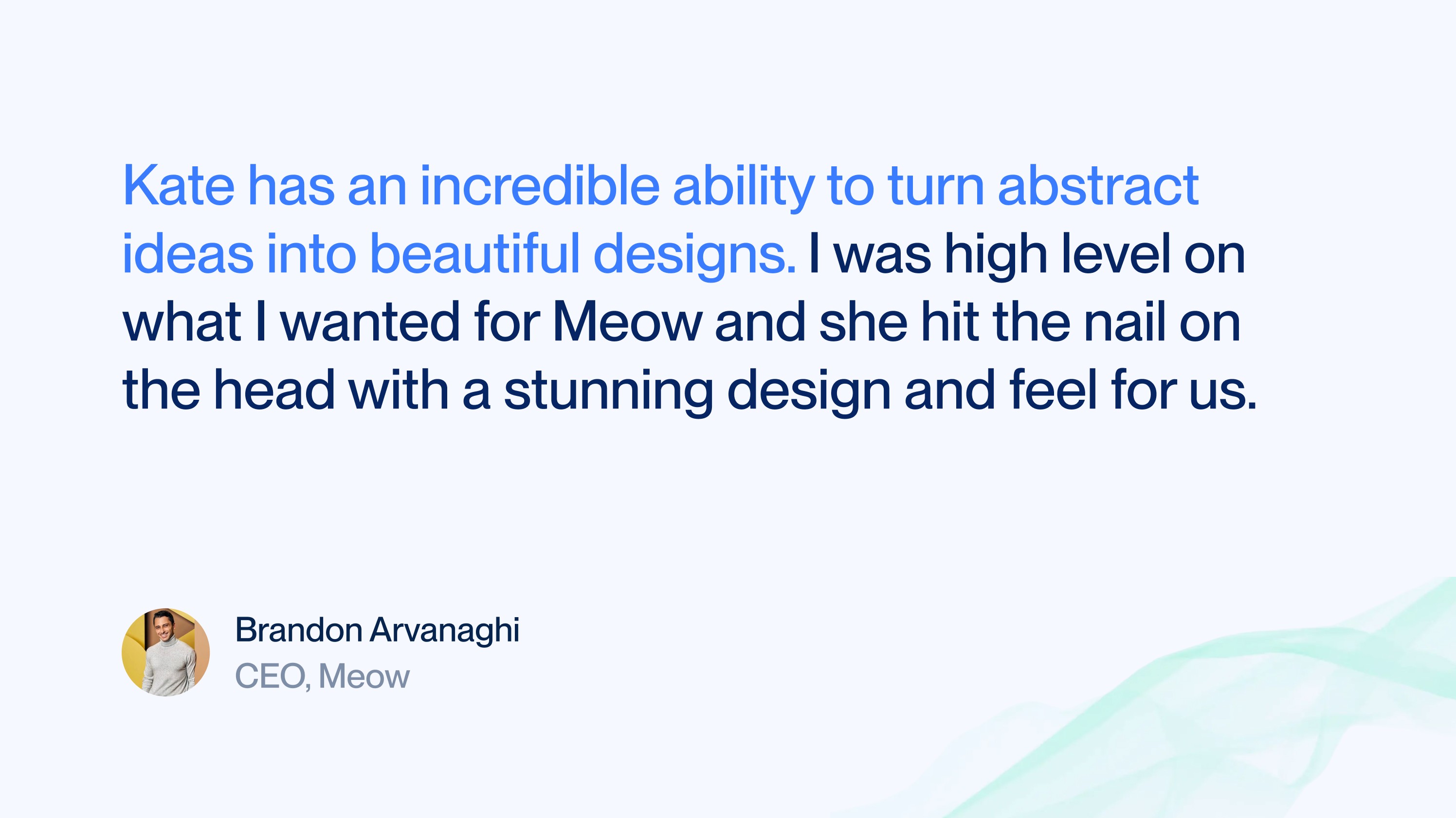
One skill I'm particularly proud of is my ability to deescalate situations and always find opportunities to deepen relationships with our clients. Meow was no exception.