Overview
Company: Alchemy is a $10B crypto infrastructure start-up that powers 71% of top crypto apps, including Robinhood, Polymarket, Uniswap, and World.
Industry: Crypto
Tenure: 3 years
My Role: Lead Brand Designer
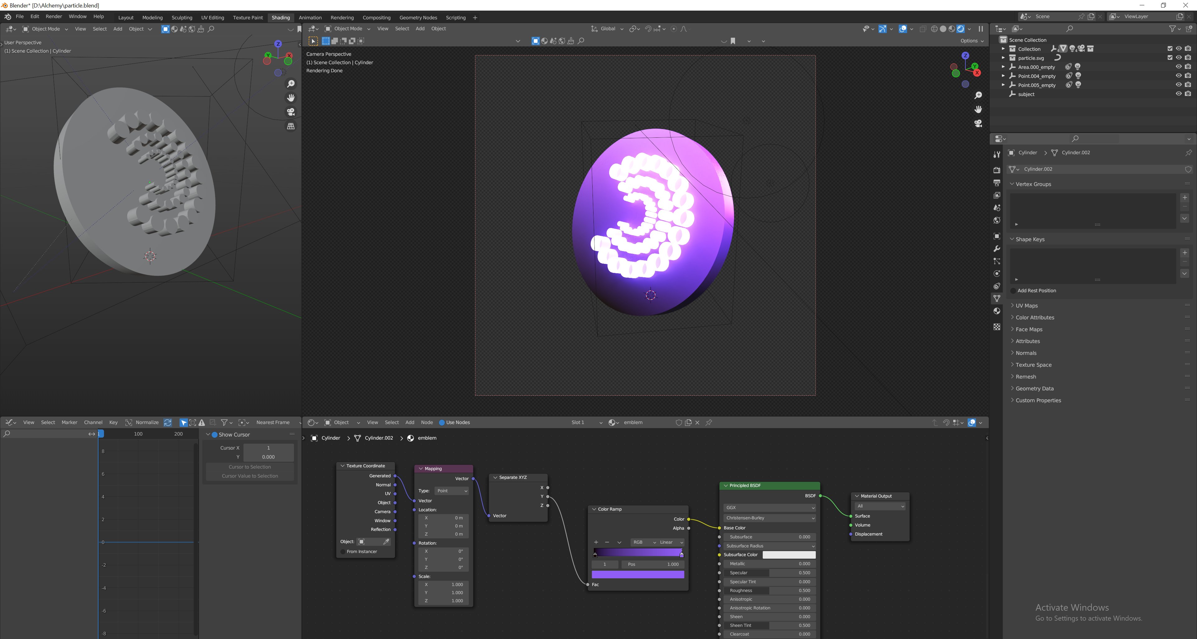
Tools: Figma, Adobe Creative Cloud, Blender, Dato CMS, Rive
Results
10x faster development cycles by creating & scaling our design system
30% faster site load times by migrating to a headless CMS
Elevated brand presence through strategic design leadership
Improved dev experience through a redesign of our developer docs
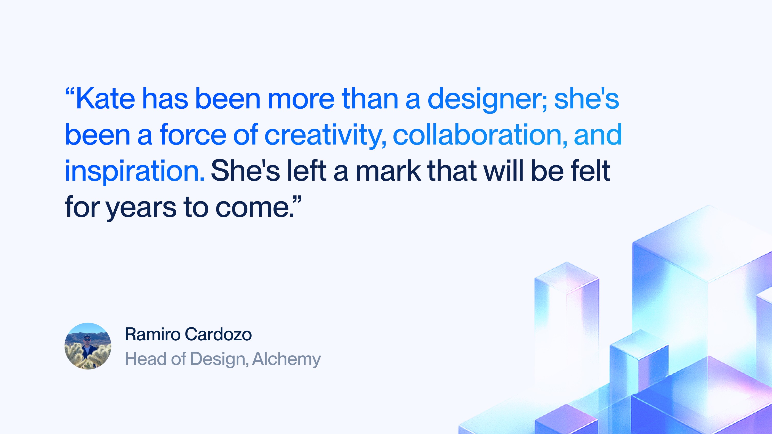
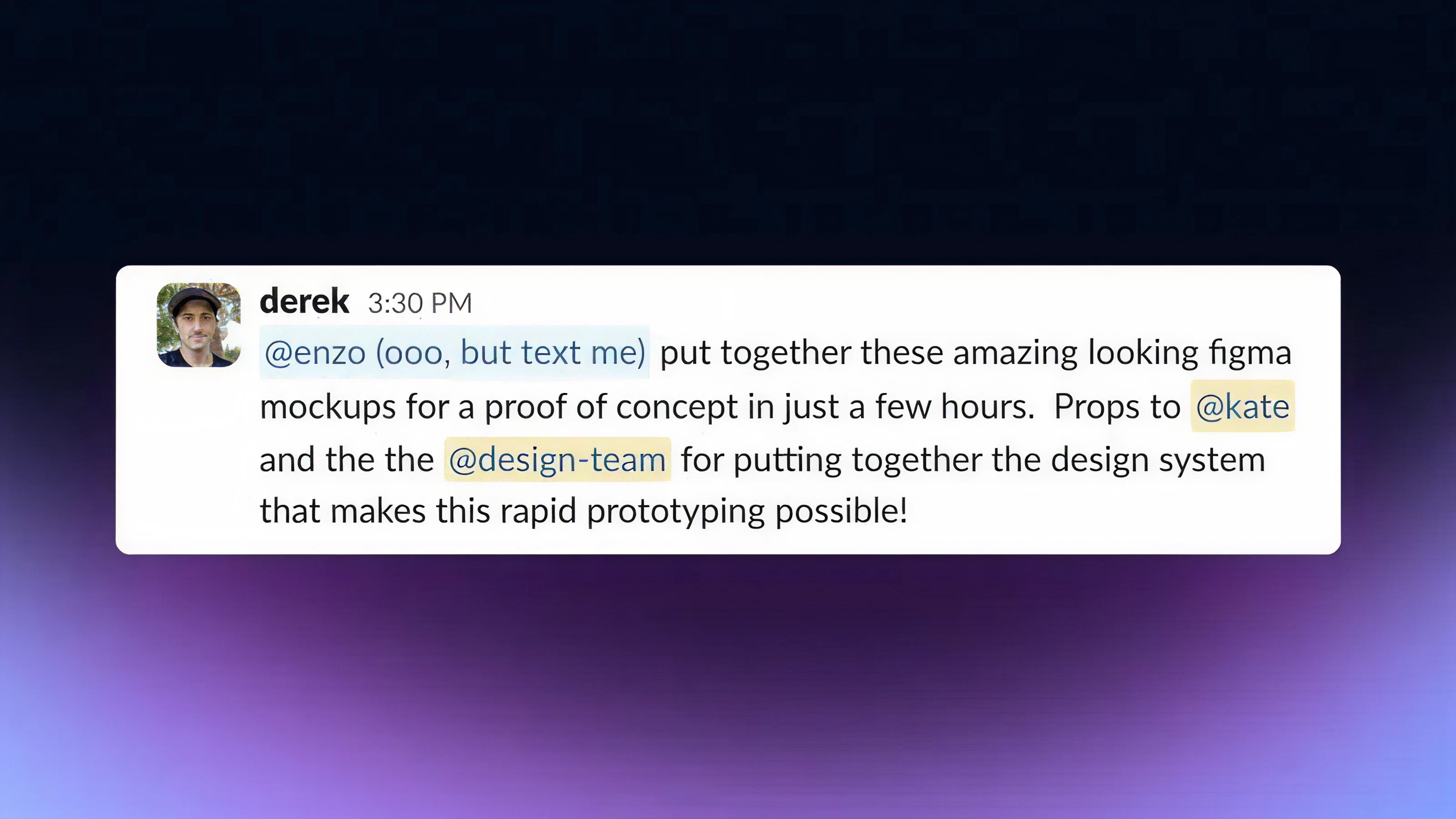
Special thanks: This was successful in large part due to the amazing team at Alchemy. While the projects I included reflect my work as an independent contributor, I'm a better designer today because of my design family: Ramiro Cardozo, Julia Dwyer, Adam Lukasik, and Yuxin Wu.
Challenge
I joined the team to solve:
No cohesive brand narrative or visual identity for our products
Leading creative ways to bring our new products/APIs to market visually
Maturing our visual identity to attract enterprises, namely: financial institutions
Design debt and inefficient workflows
Resolution
During my 3 year tenture:
Advocated for & built a design system 0->1
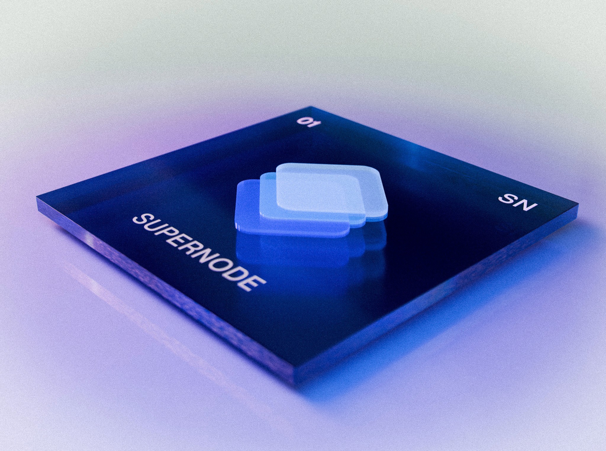
Crafted a compelling narrative for our product suite: The Alchemical Table
Led and executed visual collateral for key product launches, such as Alchemy Smart Wallets and Rollups
Pioneered improved workflows between design & marketing
Led a website migration from Webflow to a headless CMS
Designed sales collateral that contributed to landing customers, such as Polymarket and World
Managed a small team of brand designers
Alchemical Table
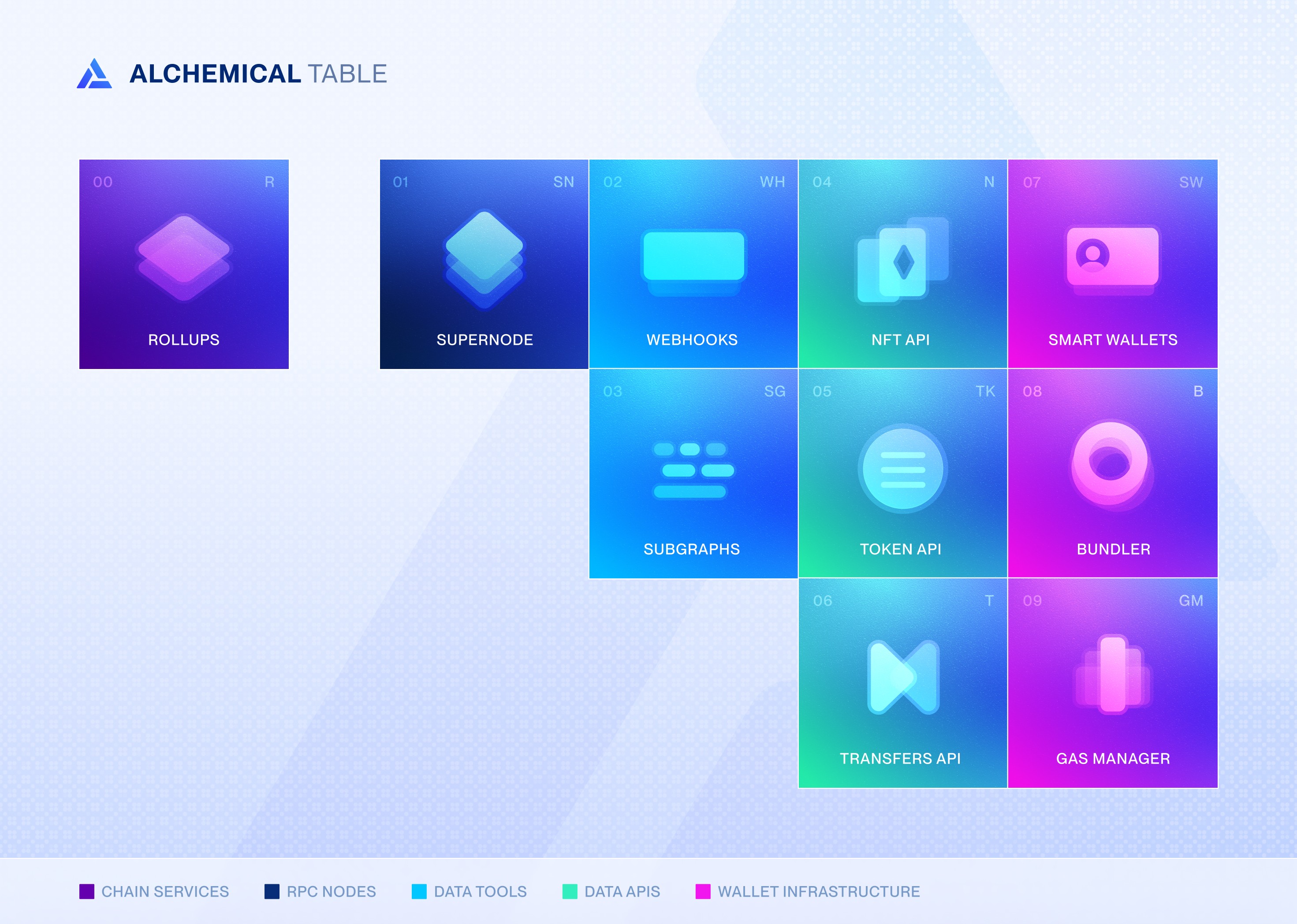
Successful brand design needs to be rooted in a compelling narrative that resonates with your customers.
In our case, I envisioned a story in which our developers weren't just 'blockchain developers' - but Alchemists in the literal sense - transmuting our APIs to create blockchain magic (apps).
By positioning each of our products as a piece in our Alchemical Table, developers could feel like a part of that mission, and product discovery and activation could reap the benefits of: "Hmm, wonder what else is offered in the Alchemical Table?"
Design System
I built our design system 0→1. No one told me to. I saw the long-term cost of not having one and acted.
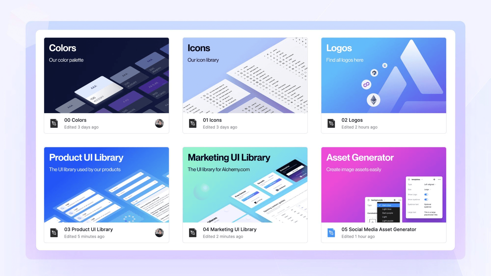
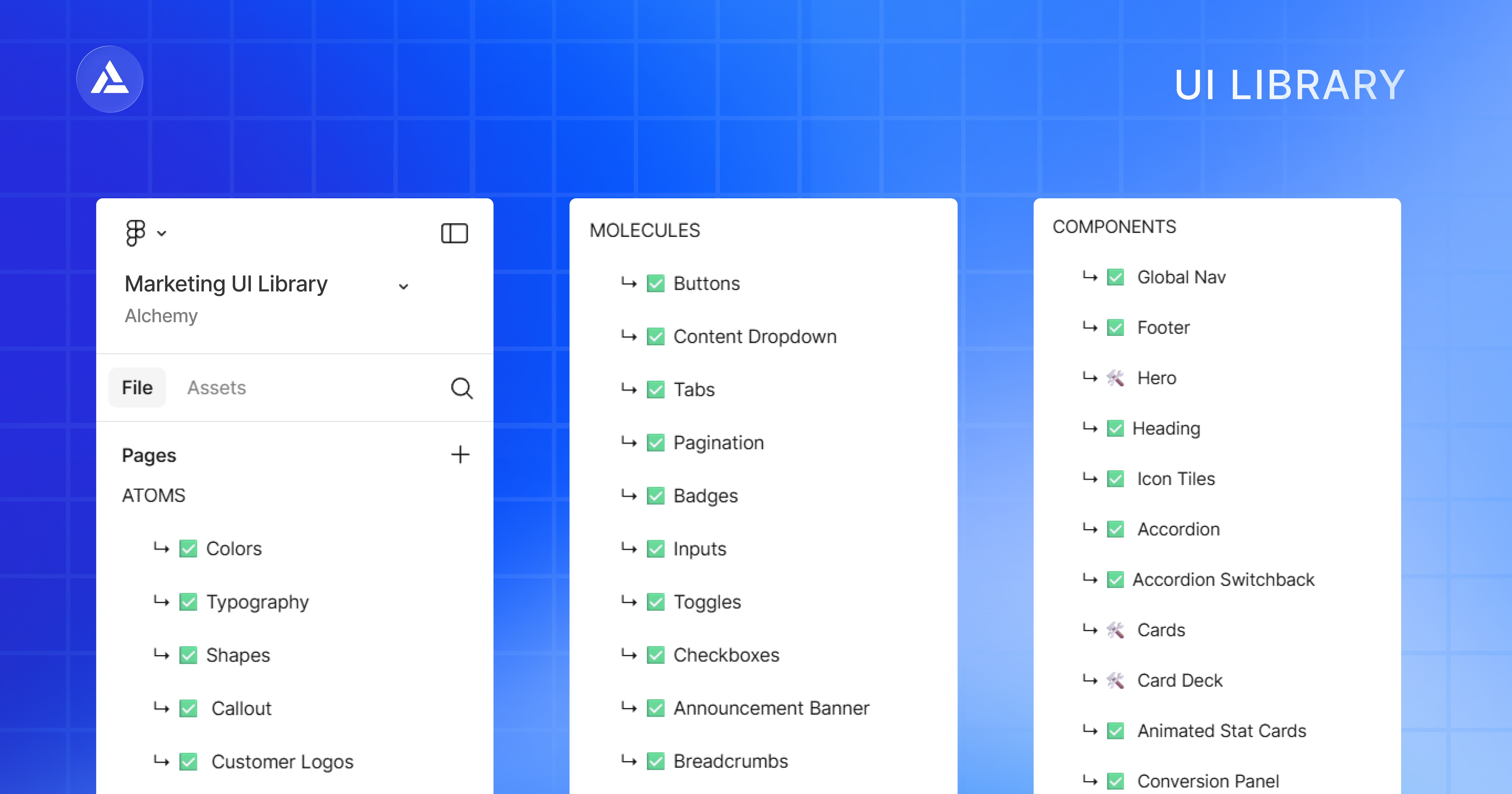
In Figma, I established how our libraries would communicate to ensure they could scale across both marketing and product teams.
This included 2 custom UI libraries for each team. They were built using the Atomic Design methodology and housed hundreds of custom components built on the Tailwind CSS framework, enabling our developers to move quickly and ensuring we all spoke the same language.
The Marketing UI Library unblocked our website migration effort, where we moved from Webflow to our own headless CMS.
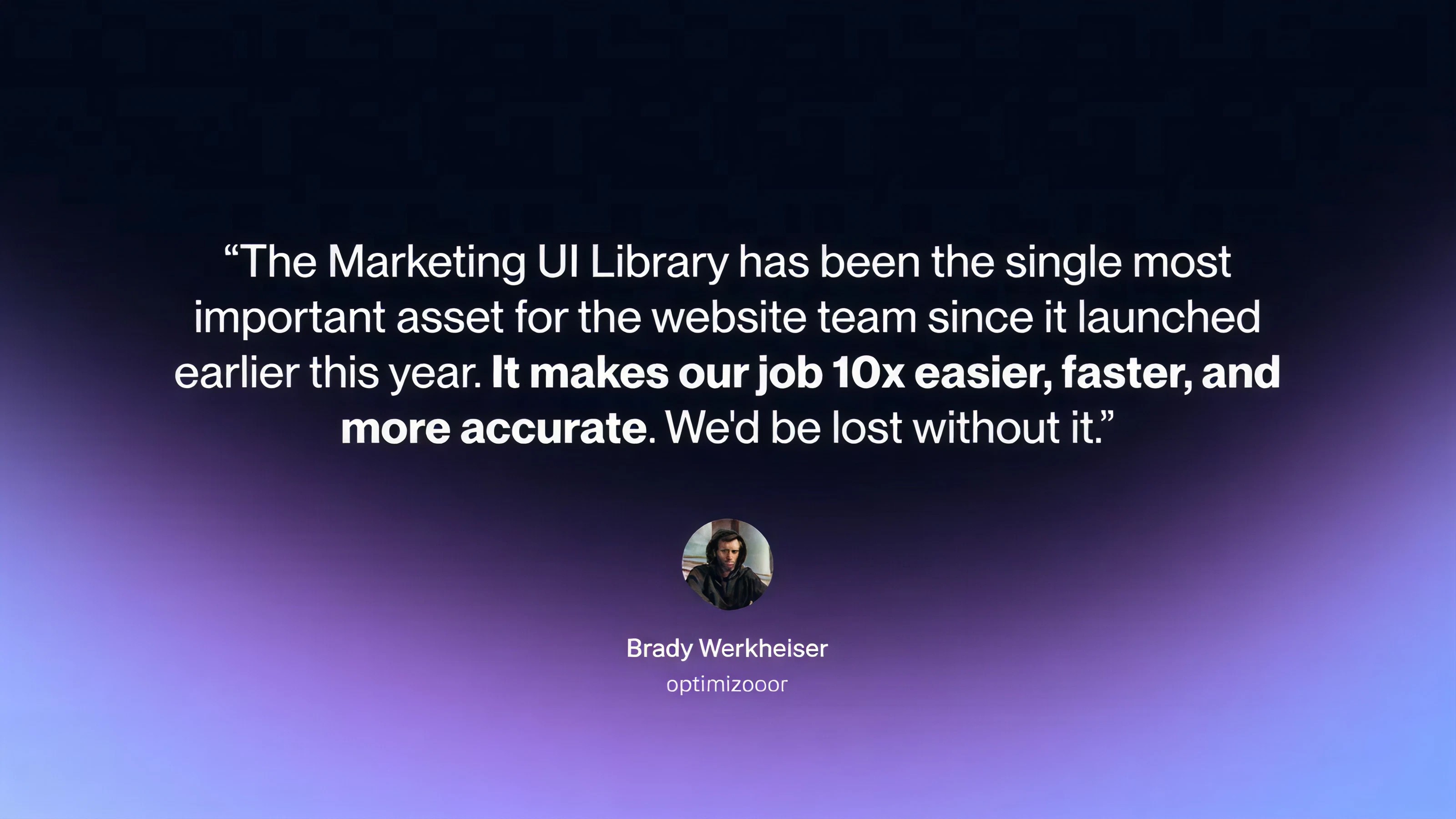
In addition to the website migration project, I gained buy-in for other areas of the design system by weaving them into smaller projects first. I tested with concentrated groups and built advocates. Once the impact was proven, other teams came on board.
To raise team adoption, I ran training sessions and created Loom videos for designers, engineers, and marketers. Within the first quarter, all of design, all of frontend, and a handful of marketers were actively using the system.
By Q2, the system powered 100% of new web pages and 50% of product UI.
Brand Hub
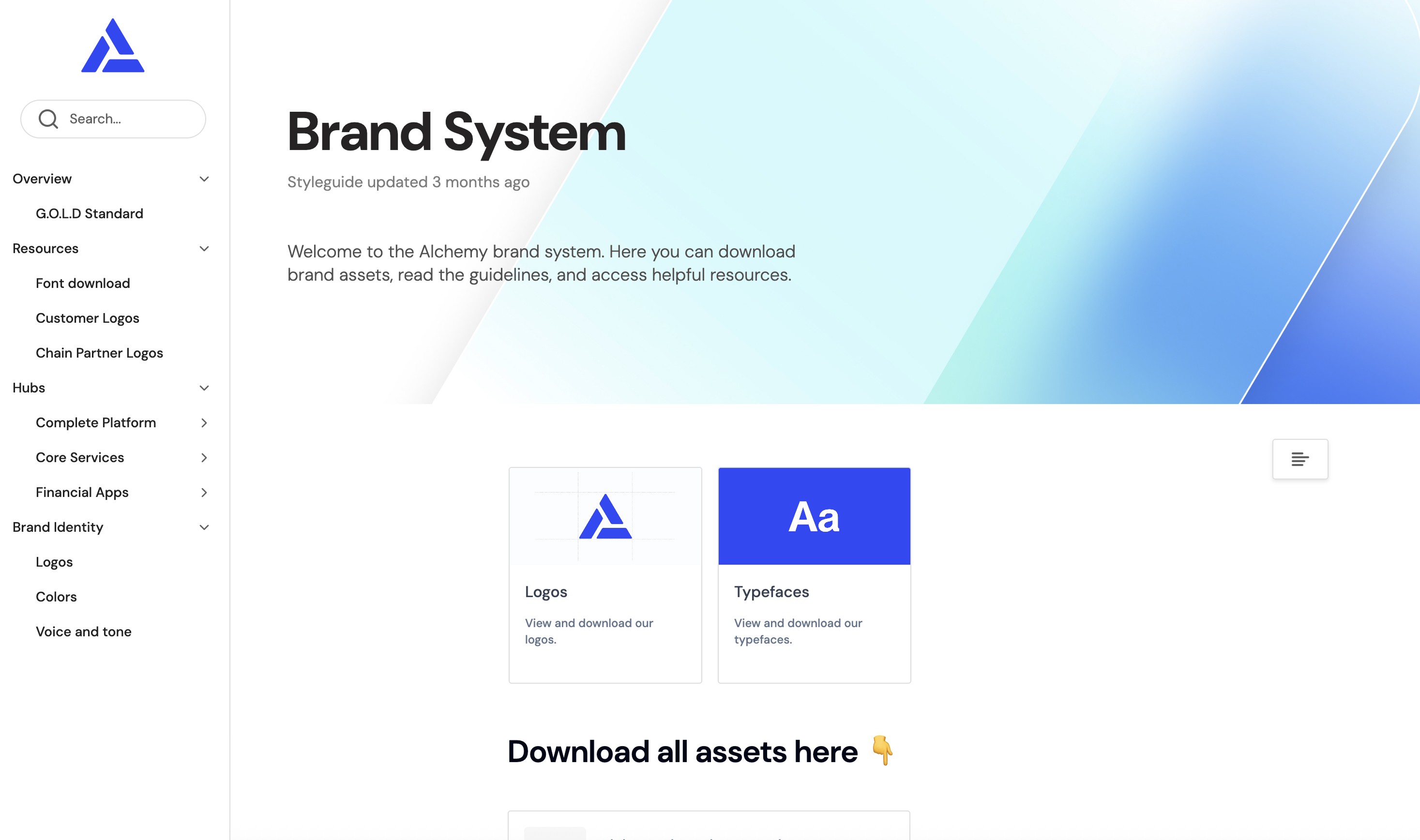
To bring the design system effort accessible across the whole org and externally, I built and shipped design.alchemy.com to serve as our central brand resource. Everything in one place, synced with Figma so it's always up to date.
A system is only as successful as its adoption rate, so I was thrilled to watch design.alchemy.com become sticky across teams.
Account Kit Launch (Smart Wallets)
When we were gearing up to launch Account Kit / Modular Accounts, I had only one week to:
Create a subbrand
Design and build its landing page
Lead vision and execute on the social assets for launch day
All solo.

This was Alchemy's Smart Wallet effort, where we competed against companies such as Privy and Dynamic. Our edge is that we offer the full toolkit: from bundling transactions to gas sponsorship and more.
On such a tight deadline, we decided to go for a visual direction that was different than our competitors - something that would make someone stop scrolling on X and ask, "Wait, what's that?" and rectify the impact on our brand identity later.
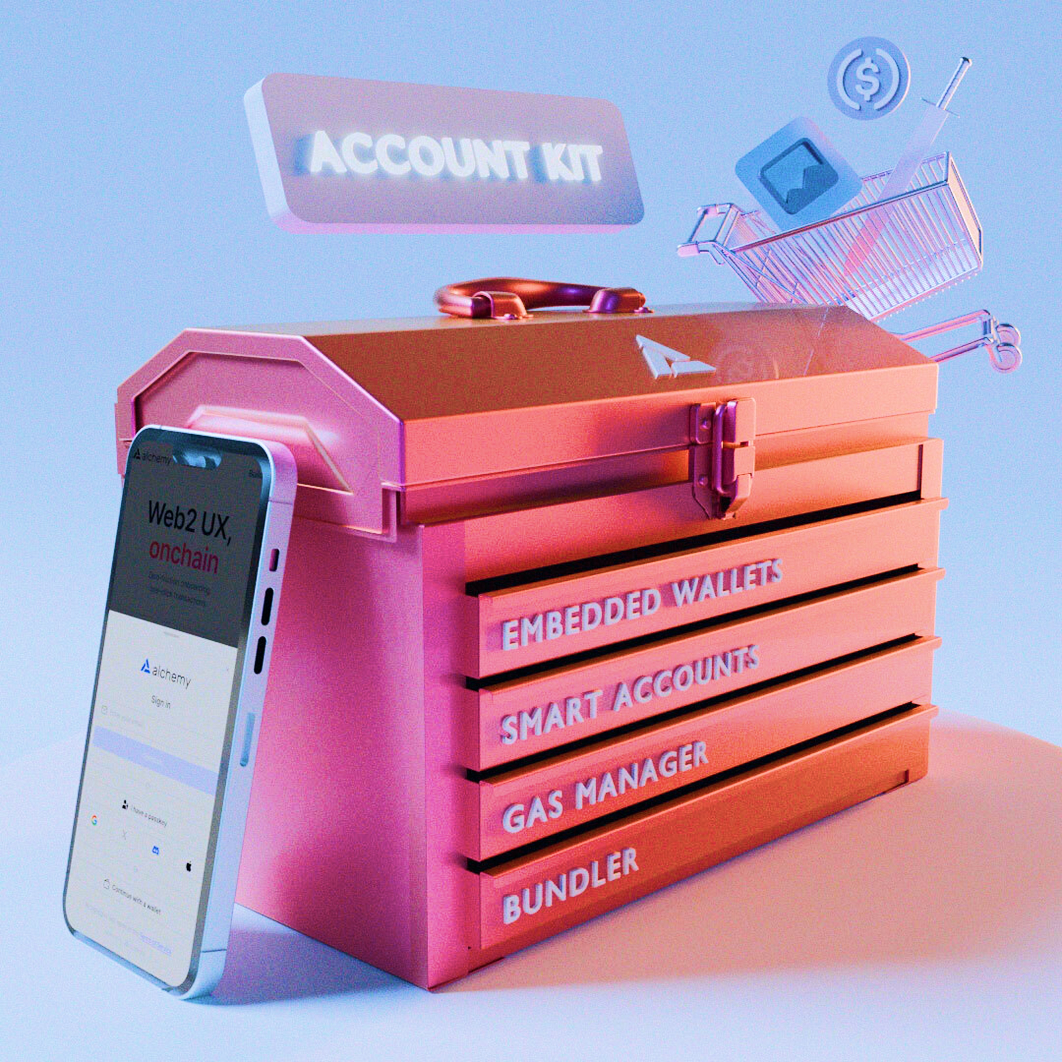
I'm usually averse to such brand debt, but there was more risk in not moving quickly.
One of my favorite parts was designing our partnership social images for the Modular Account part of the launch. I made custom 3D graphics for each partner logo and composited them with our announcement.
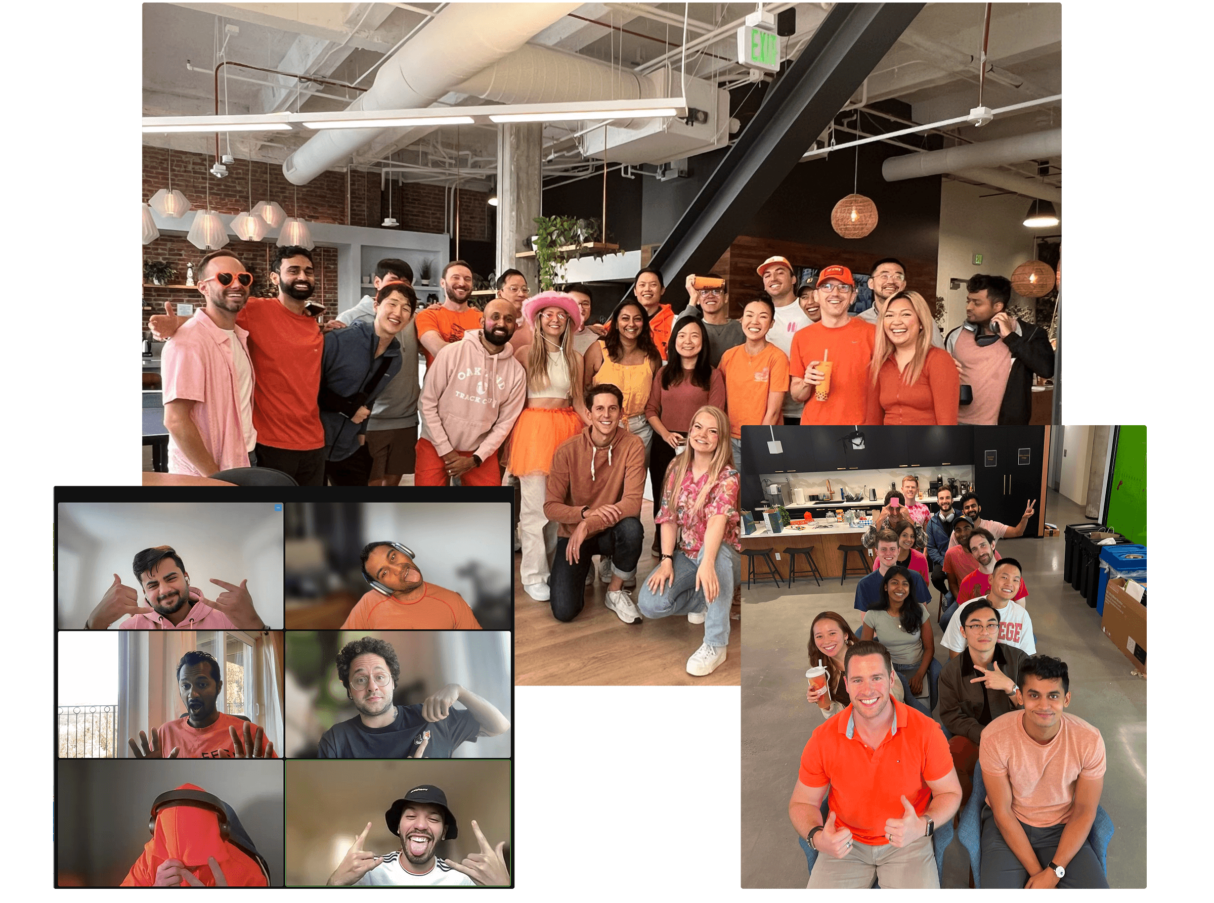
For launch day, I got the company (across both SF/NY offices + remote!) to dress in pink/orange.
Something I'd do differently is work on the Alchemical Table sooner; subbrand design debt is particularly challenging to address without leading with a cohesive vision, and the risk to brand awareness is high.
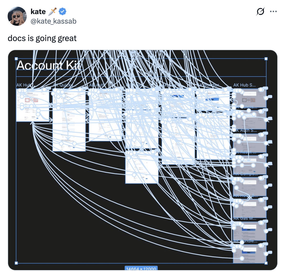
Docs redesign
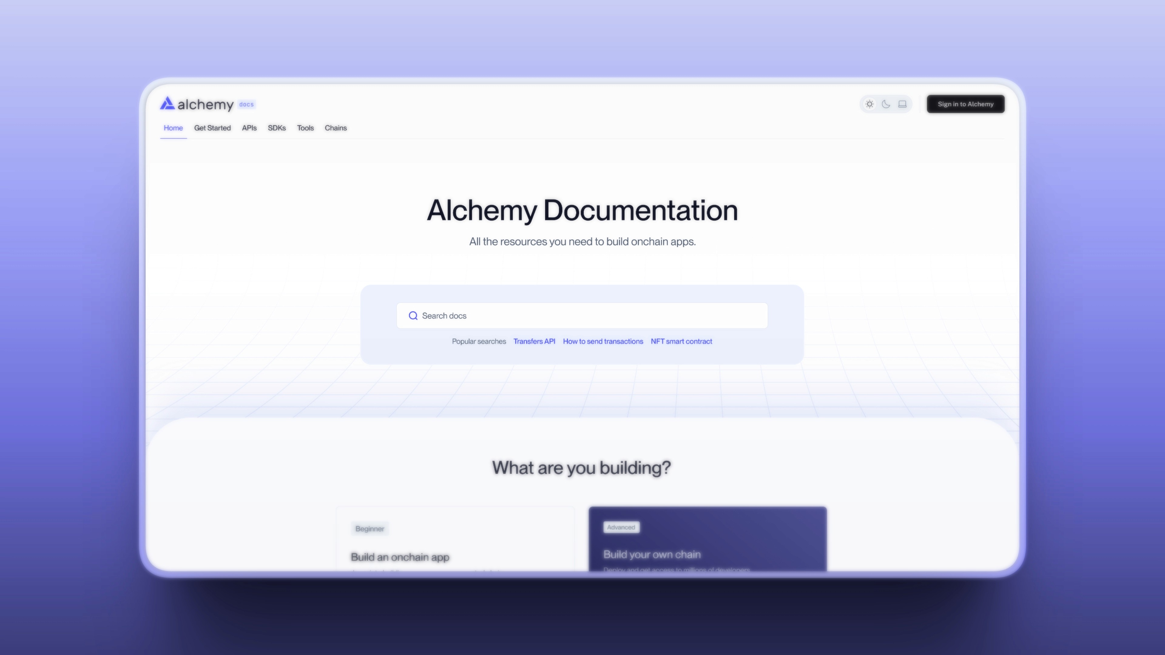
One of my last big projects at Alchemy was rebuilding our documentation site to better serve developers and drive adoption.
Our existing docs site hadn't kept up with our pace of shipping new product lines and had critical UX problems around information architecture.
We decided to expand the project to include some design TLC as well.
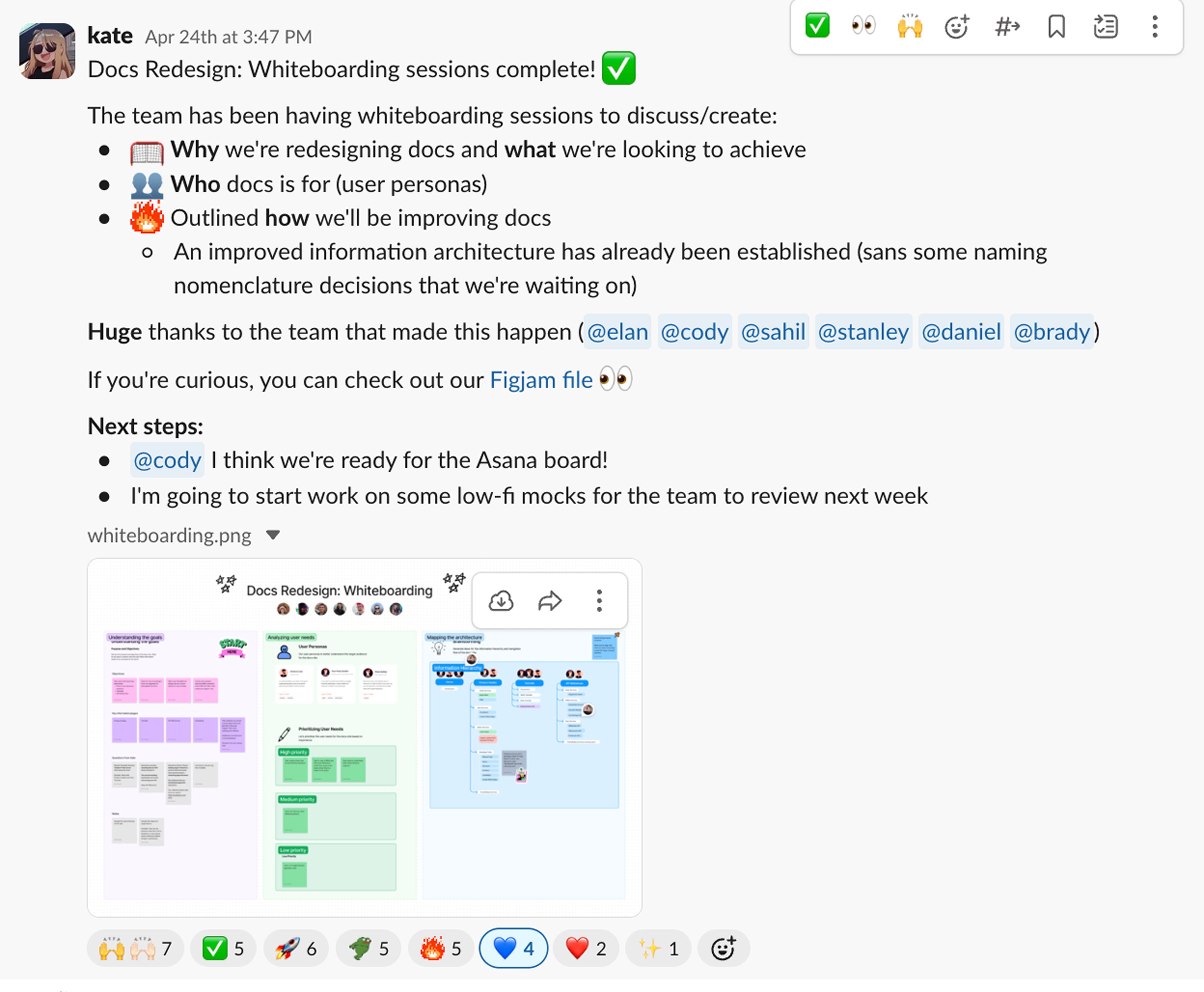
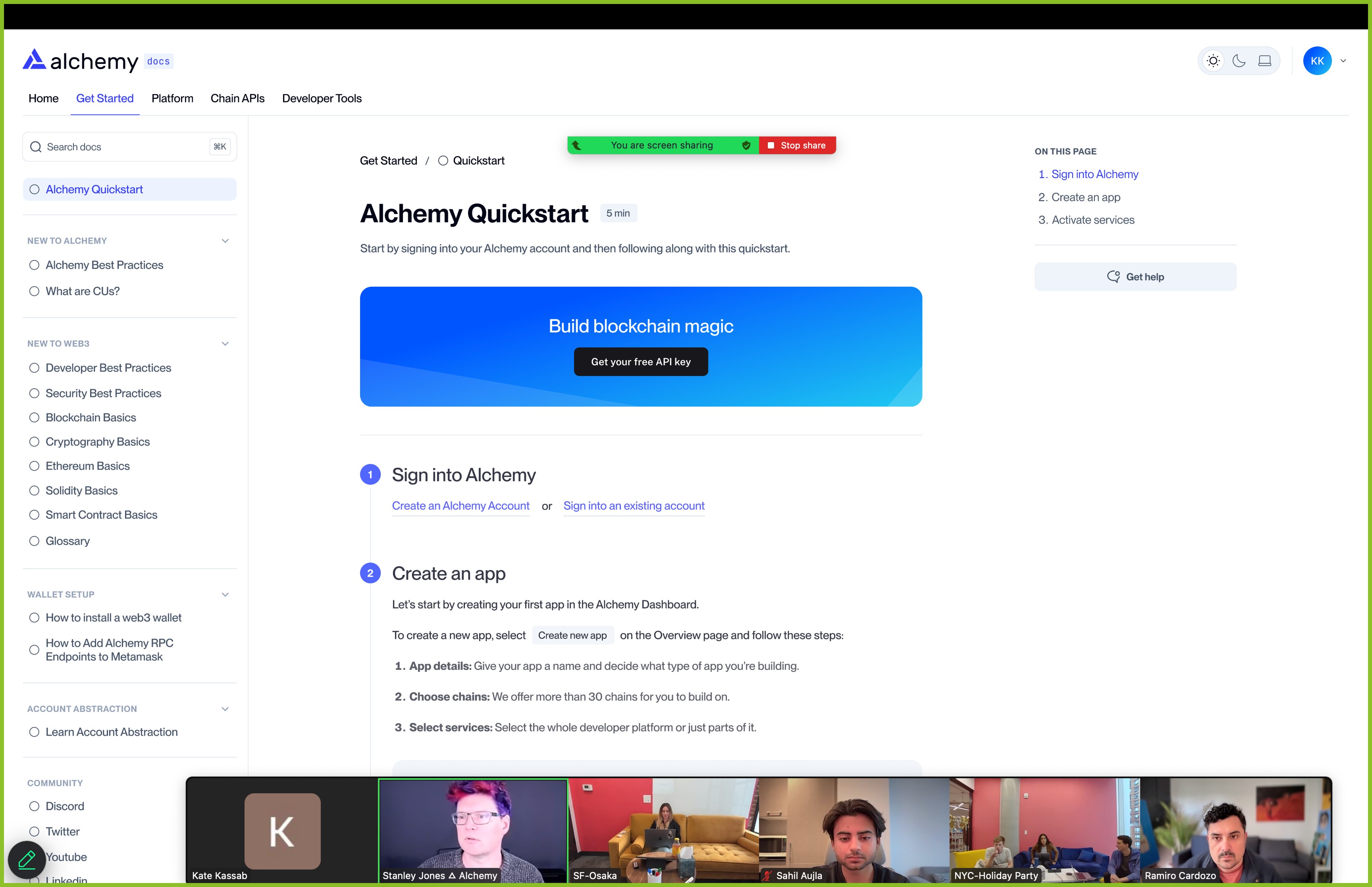
This was a large-scale project involving multiple teams, so I knew it was critical that the design workshops be highly collaborative. From jam sessions to formal design reviews, teams across design, eng, and customer success came together to serve the best possible experience for our developers.
While I left shortly after launch, early signals were promising:
Positive developer feedback in user testing sessions
Developers reported finding what they needed faster
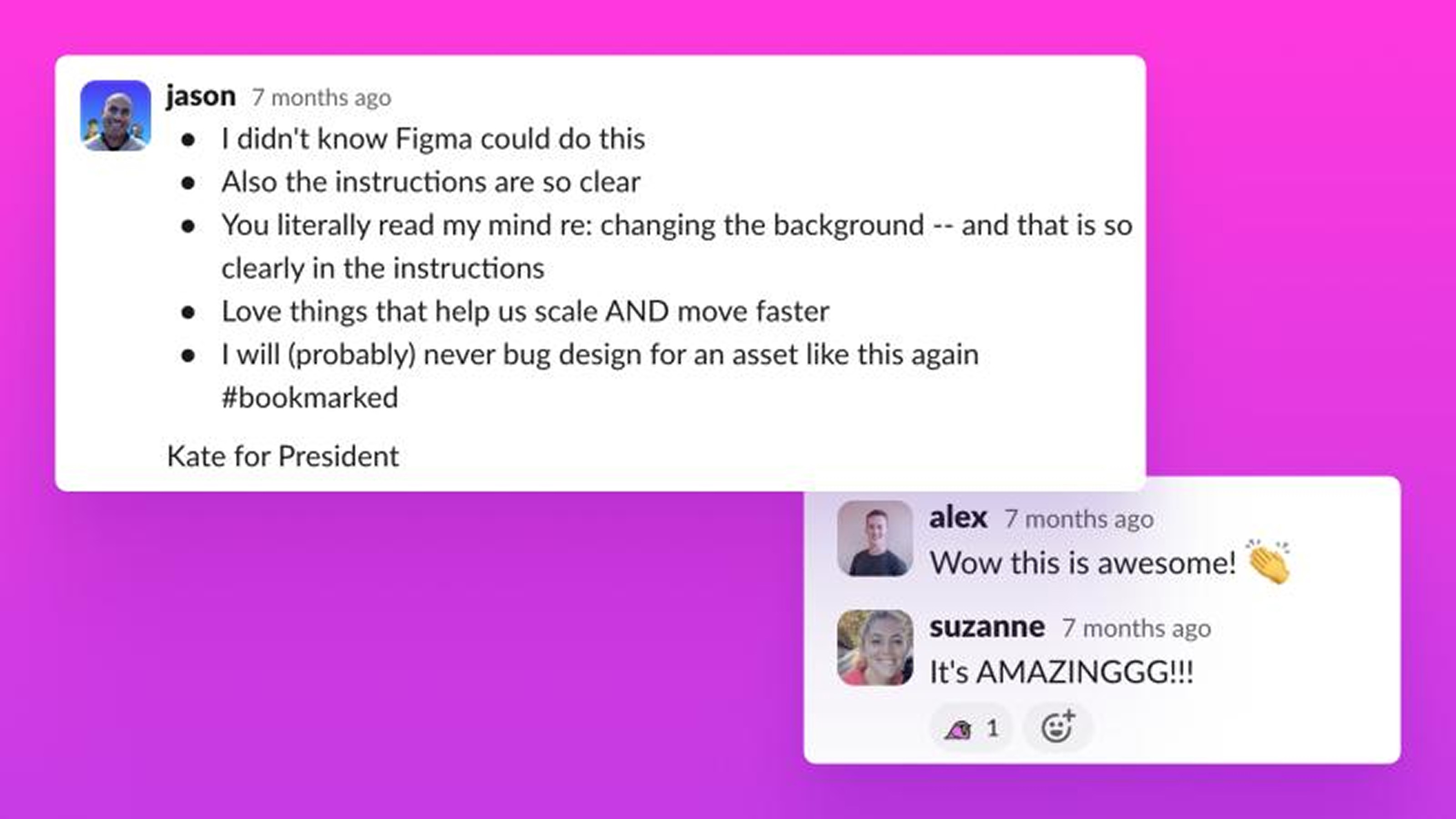
Asset Generator
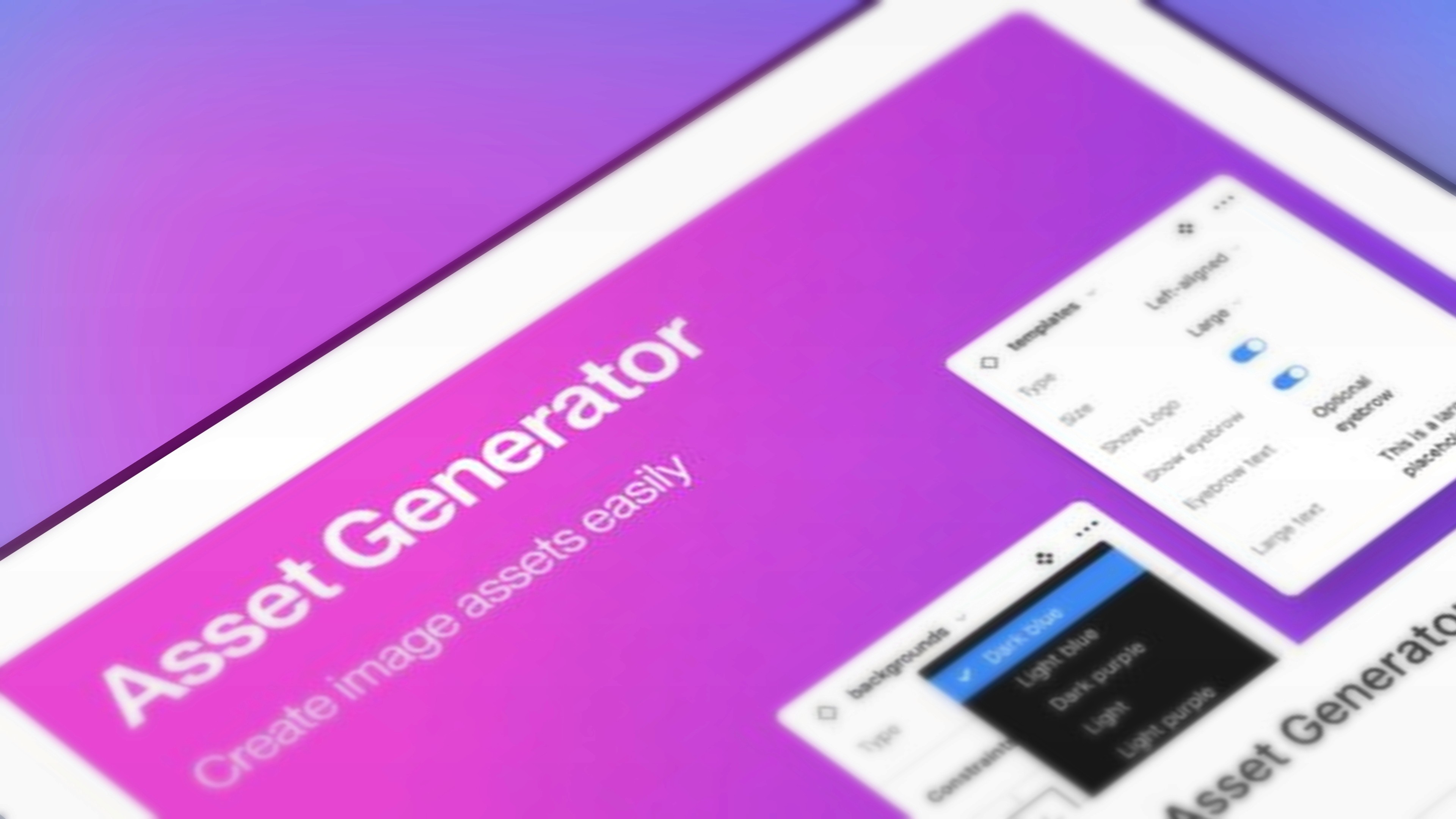
One major opportunity was to address the bottleneck of never-ending, last-minute social image requests.
I decided to build my own tool: Asset Generator. This unlocked Marketing, generating dozens of on-brand variations in minutes rather than waiting days for designer availability.
The shipping velocity of on-brand social images increased significantly, allowing me to focus on strategic work.
Collaboration
Working at Alchemy taught me that the best design work happens through collaboration, not isolation.
I learned to:
Create a brand identity that transcends just looking cool
Create systems that empower teams rather than create dependencies on designers
Move fast without sacrificing quality
Design with an incredible amount of esoteric crypto knowledge floating around in my brain
These projects succeeded because I worked alongside talented people who challenged my thinking and made the work better (and, honestly, more fun).