Overview
Company: Helius is an enterprise-grade Solana developer platform and the #1 staking provider trusted by companies like Coinbase, Bloomberg, and Bitwise Asset Management.
Industry: Crypto infrastructure
My Role: Solo designer
Tools: Figma, Adobe Creative Cloud, Rive, Blender, Linear

Results
Reduced support requests by redesigning crypto subscription flow for better self-service
Solved dedicated nodes purchase friction through redesigned selection flow
Improved time-on-site with animations that made technical concepts digestible
Accelerated portal shipping from weeks to single-week sprints via UI library and prototypes
Strengthened hiring pipeline with new careers page
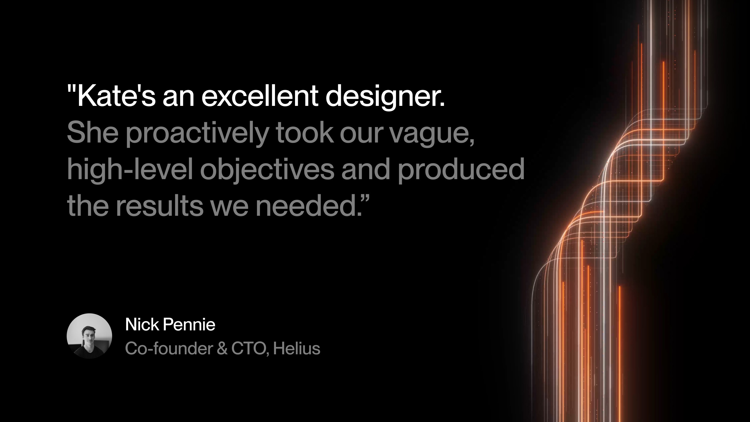
Special thanks: To Mert—the trust and autonomy he gives his team is unrivaled. And to Nick, Haji, and Vishant: I wouldn't rather be in the dev portal trenches with anyone else.
Problem
I joined Helius to lead and execute design across all surface areas.
This meant solving:
Poor purchasing and billing UX directly affecting revenue
Customer confusion around crypto subscriptions
Lack of website design support
Lack of block explorer design support
Unestablished design direction

Resolution
During my tenure:
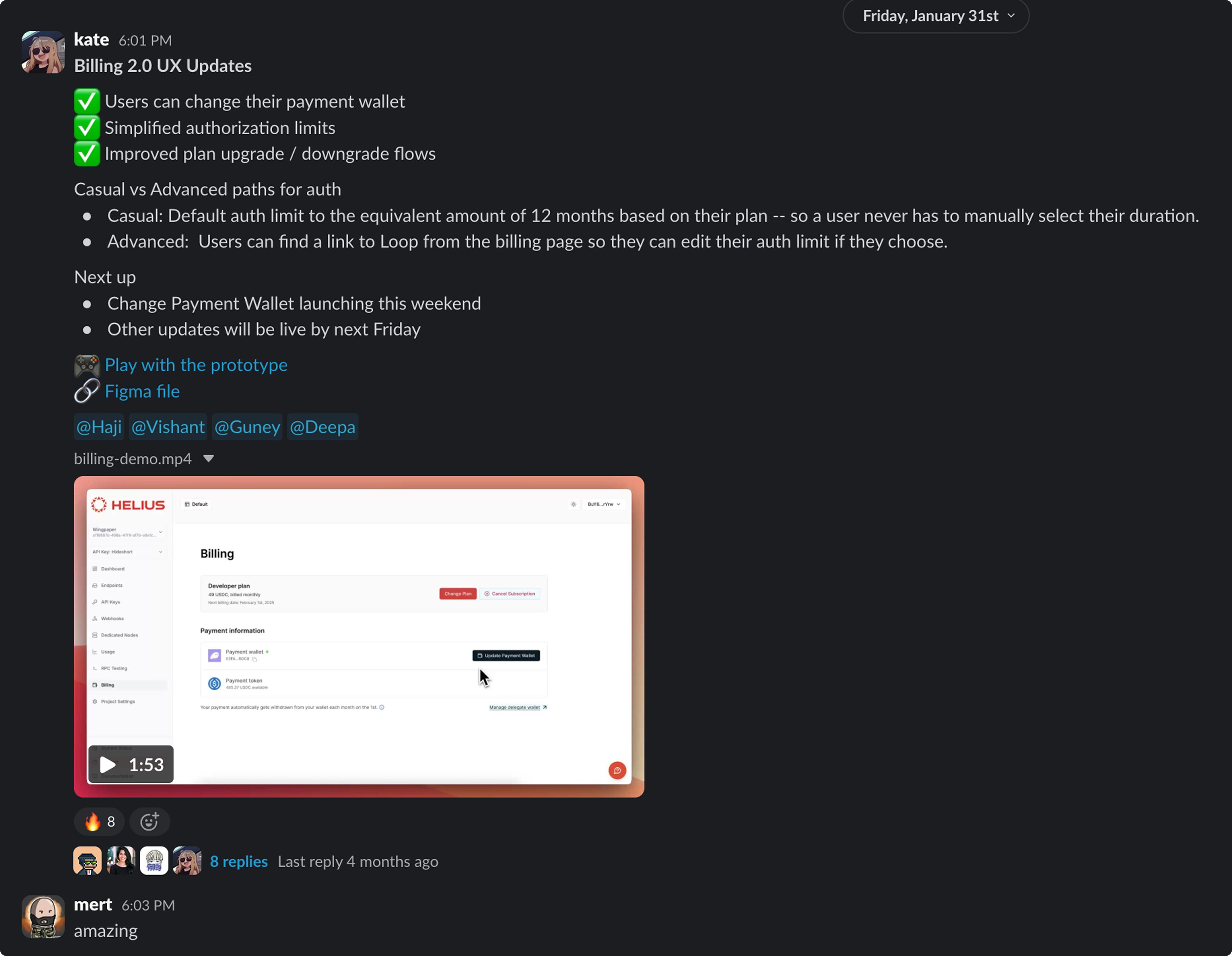
Our billing 2.0 redesign significantly reduced support tickets
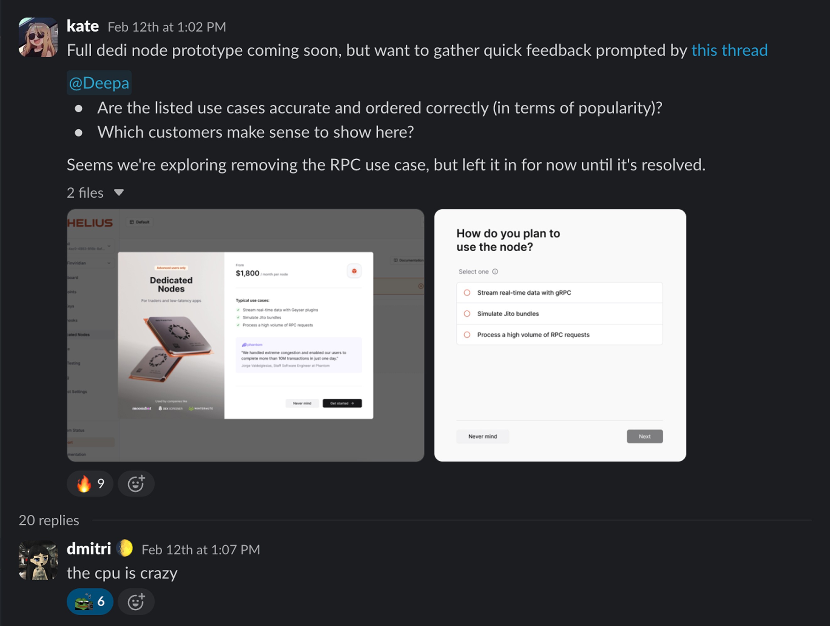
I designed a guided wizard to help developers choose the right node for them, where testing proved understanding and confidence around purchase improved across the board
I PM'd our developer dashboard and moved us onto a UI library to ship faster
I designed Rive animations on our website that simplified complex concepts
I shipped a new careers page to strengthen our hiring pipeline
I advised design on our block explorer Orb (s/o Airfoil for the original design)
Terminal exploration
Most terminal UI leaves users feeling panicked or stressed, so we created an exploration of what a more simple version could look like.
I created this in a single day with Mert as an artifact to see how it landed before allocating more resources.
Ultimately, it was decided to embed the buying option in our block explorer: Orb.
Dedicated nodes
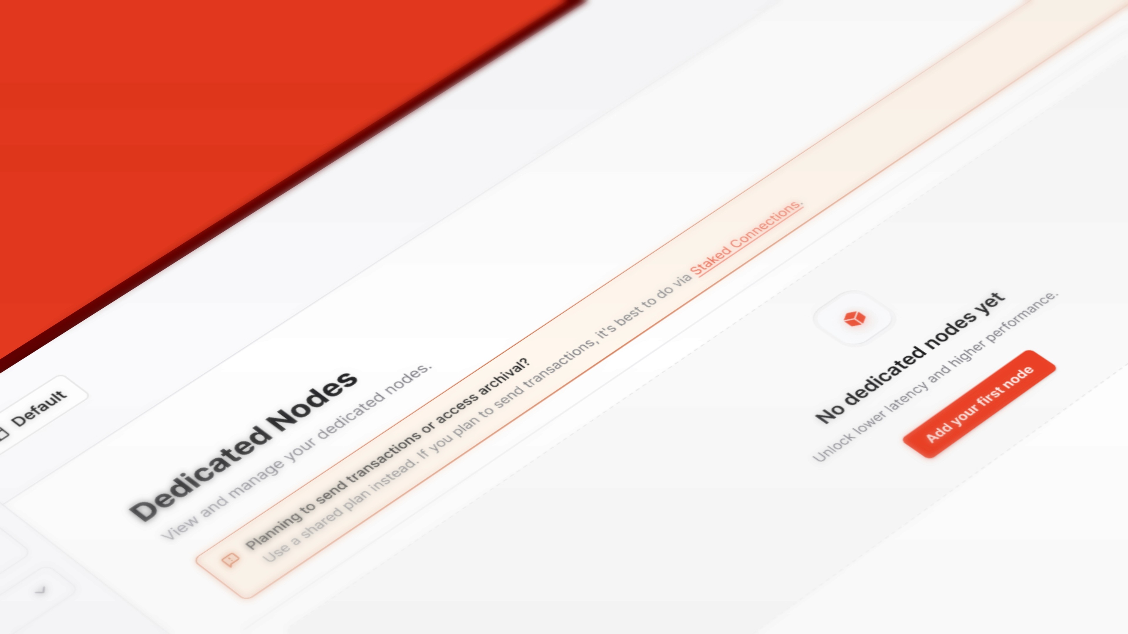
Developers frequently purchased dedicated nodes that didn't meet their actual needs, and we only discovered this after they'd already completed payments.
Each mis-purchase meant:
Support tickets to understand what went wrong
Downtime or performance issues for their app
Frustration with the buying experience
Lost revenue opportunity if they churned
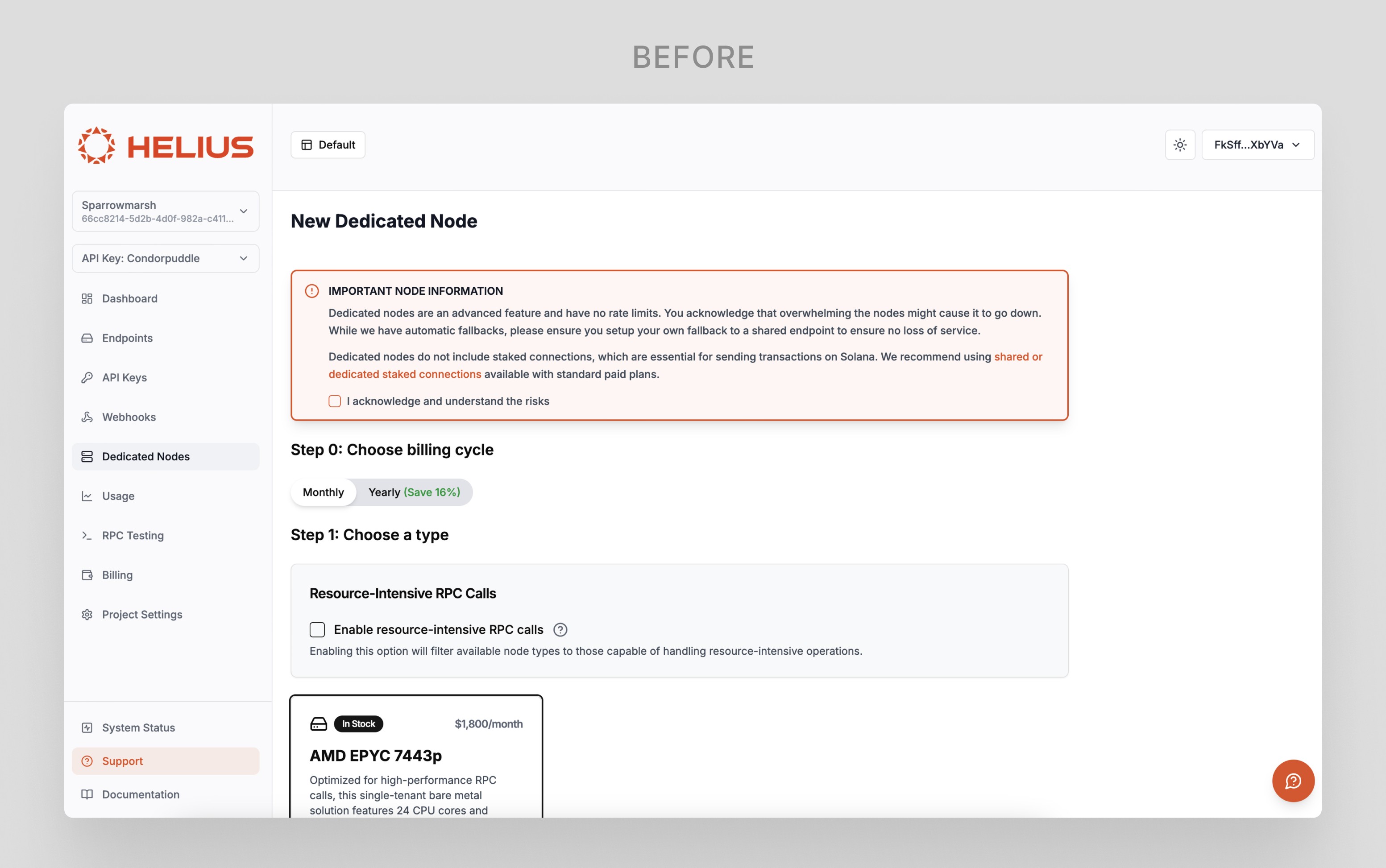
To solve for this, I designed a wizard to guide developers to the right node for them.
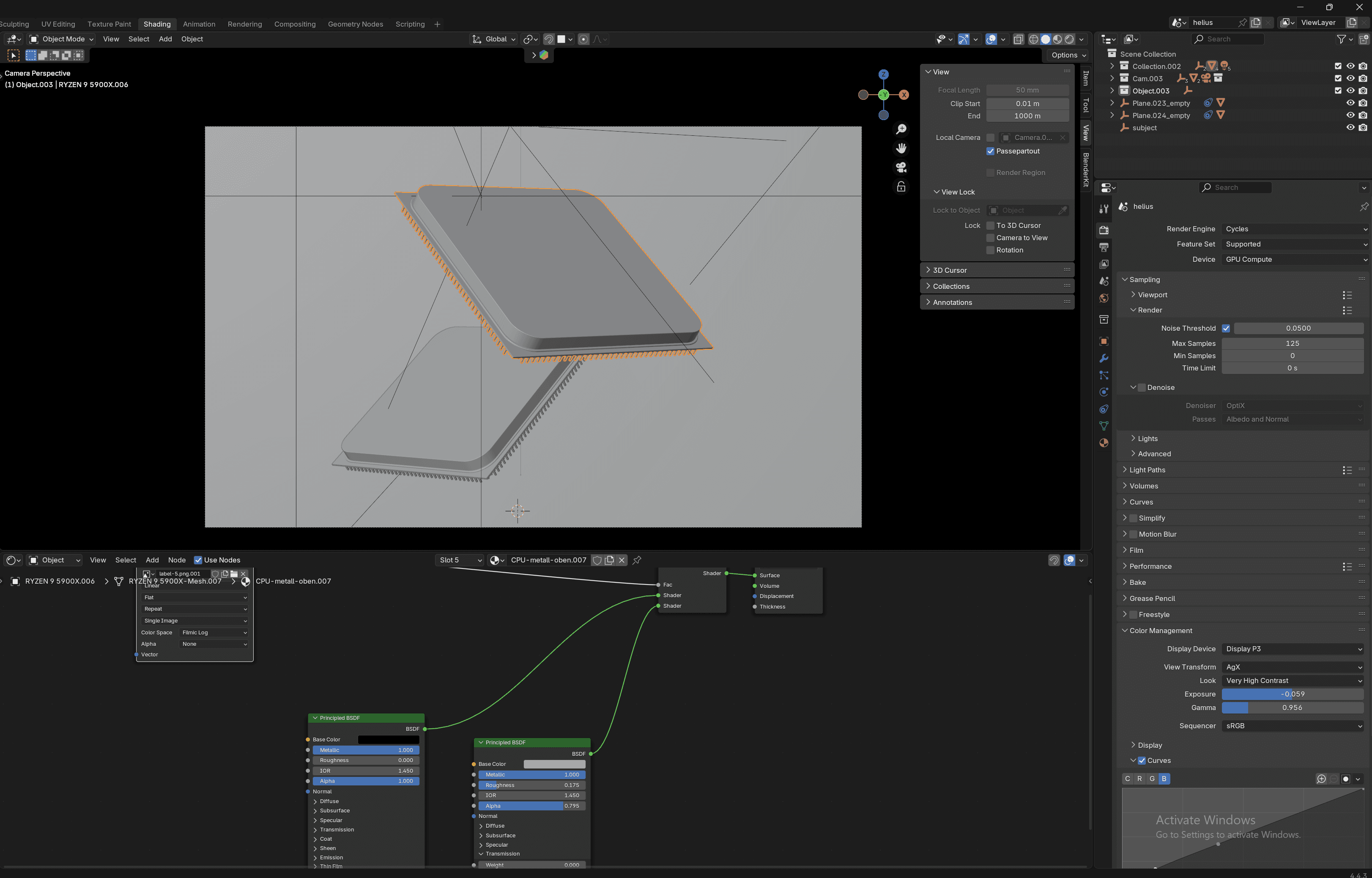
Behind-the-scenes
One of my favorite parts of this project was seeing a branding opportunity to create a Helius-branded CPU. Small moments like this, I think, really help brands differentiate themselves.

I rendered it in Blender and created the custom label in Photoshop.
Crypto subscriptions
Crypto subscriptions are notoriously difficult to get right.
They're high risk because if devs didn't properly manage their auth limits, they'd become delinquent and risk their app breaking entirely.
We were at a disadvantage because ideally developers set the limit to be high so they can set it and forget it. Realistically, developers are security conscious and prefer low amounts. This meant more frequent top-ups and a larger margin for error (or churn).
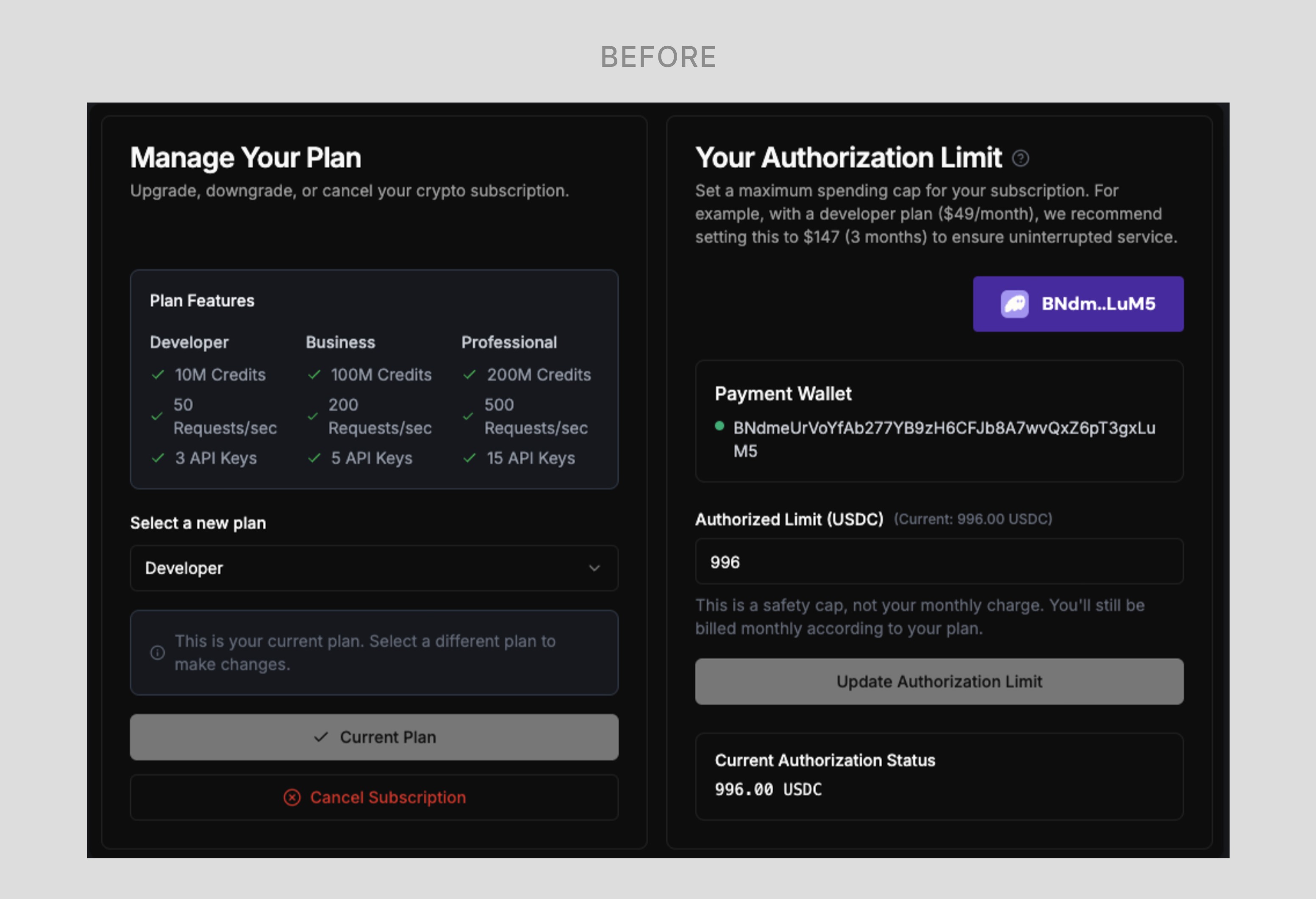
Phase 1 was scoped to just connecting the backend to Loop, our delegate wallet provider, and standing up a simple UI led by engineering - meaning our UI looked like the above at launch.
The next phase needed to prioritize redesigning the interface to be much more intuitive.
Pre-pixel pushing
This was my first experience designing for authorization limits. As with any design problem, my first step was to make sure I fully understood what was in front of me.
So:
How delegate wallets worked
Technical limitations
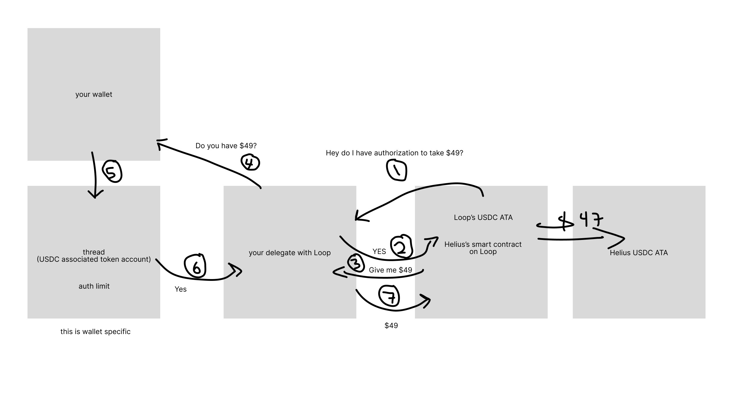
I worked with our engineer Haji to diagram the delegate wallet flow and identify all the pieces users needed to understand
First attempt
We initially moved all auth limit management to Loop, thinking it made sense to consolidate wallet operations in one place. This quickly proved problematic—sending users to an external platform for a task they might need to do frequently created friction and broke the experience.
Solution
We brought auth limit management back into our dev portal and redesigned the mental model.
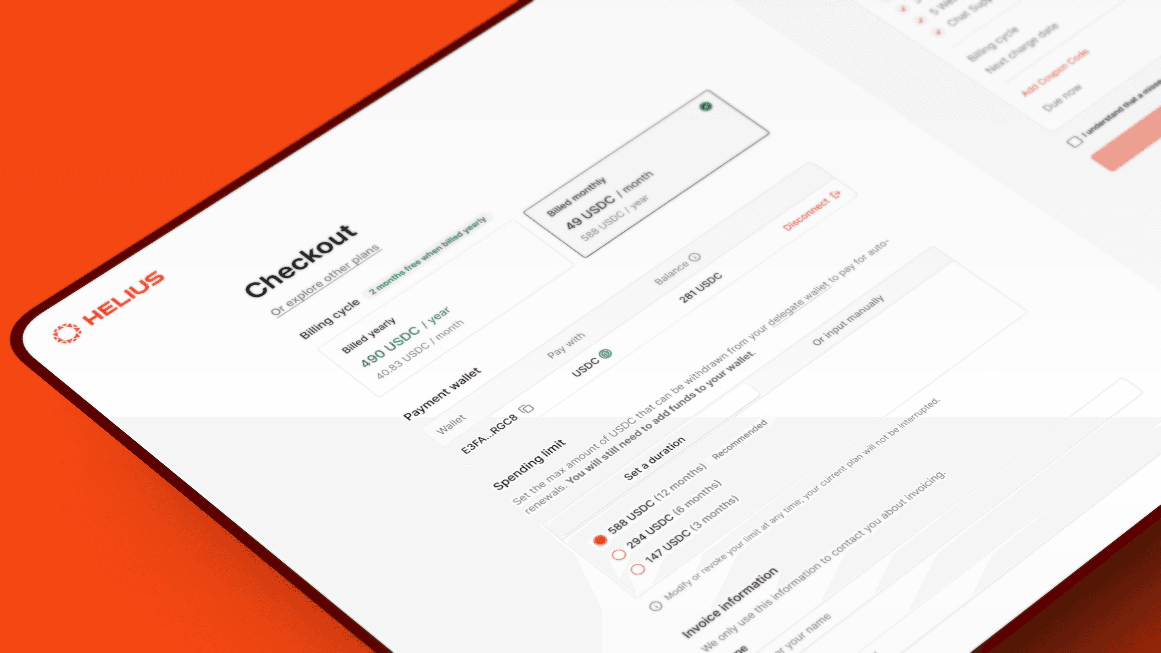
Instead of asking users to calculate and input a manual amount (which required understanding the underlying mechanics), I introduced duration-based selection: "How long do you want this to last?"
Devs could choose 1 month, 3 months, or 6 months, and the system would calculate the appropriate auth limit.
Advanced users could still set manual amounts if they preferred. As a guardrail, if a user entered "0", they'd understand it would cancel their subscription.
You'll notice that in the final design, the term was changed from "Authorization limit" to "Spending limit".
We hypothesized that the name itself was contributing to the confusion, so we teamed up with Loop.
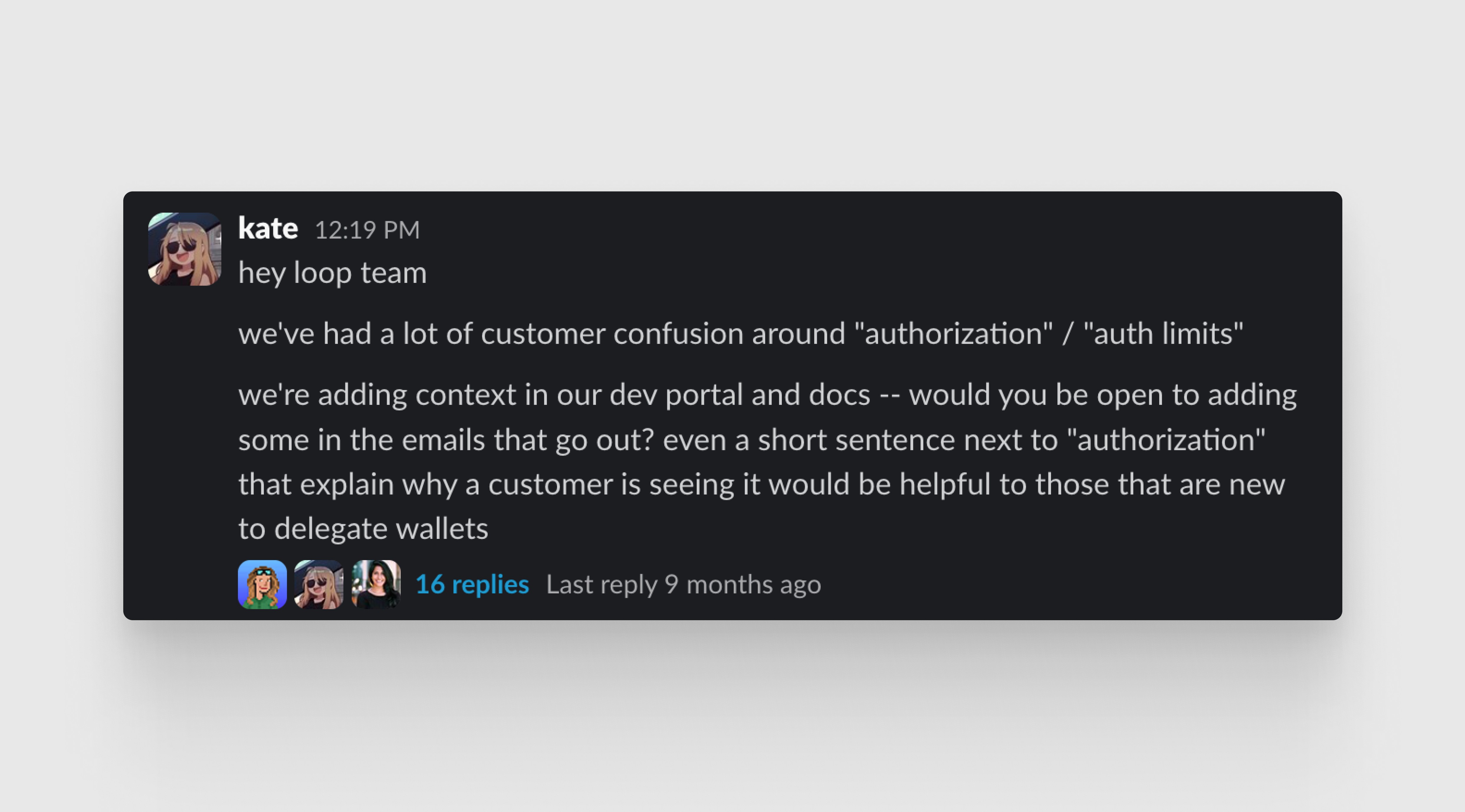
Terms we tested:
Spending limit
Spending allowance
Authorization

Testing confirmed "spending limit" was the best terminology, and we aligned with Loop on the change so it could be changed across both portals and customer emails.
Developers also raised a critical concern: they needed reassurance that they could cancel spending limits immediately after payment. We added clear copy in the checkout flow to address this, giving security-conscious developers peace of mind.
Our work resulted in less support tickets and customer confusion in Telegram.
Billing interface
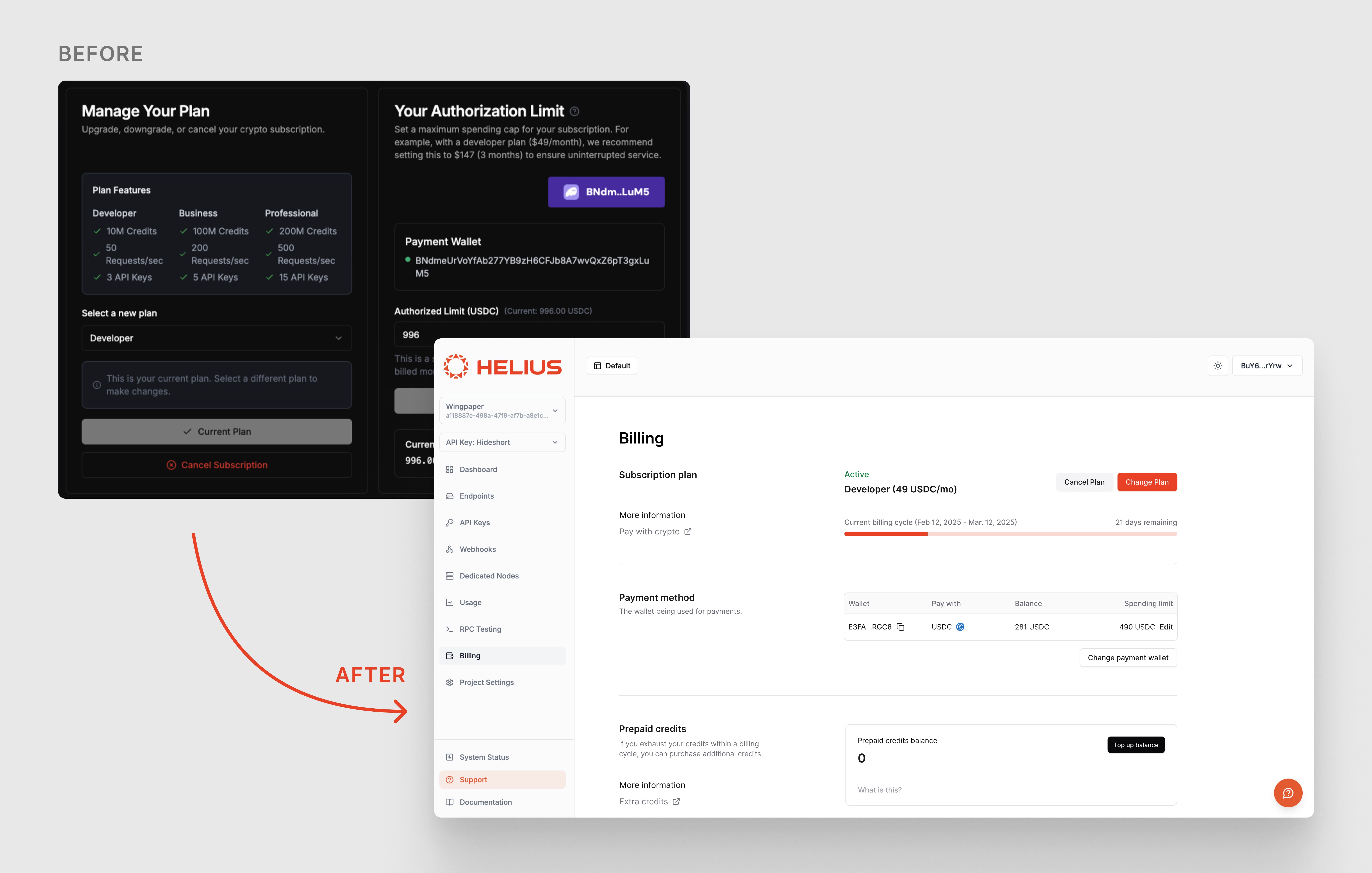
Solving crypto subscriptions was one piece of the puzzle. But to truly reduce support load, we needed to redesign the billing UI where developers managed their spending limits.
I moved billing to a dedicated page to reduce cognitive overload, changed "Authorization Limit" to the clearer "Spending Limit," and surfaced critical context, including billing cycle dates, days remaining, and wallet balance.
Most importantly, I repositioned the spending limit as one detail among many rather than the intimidating centerpiece—making the entire experience feel manageable instead of overwhelming.
Careers page
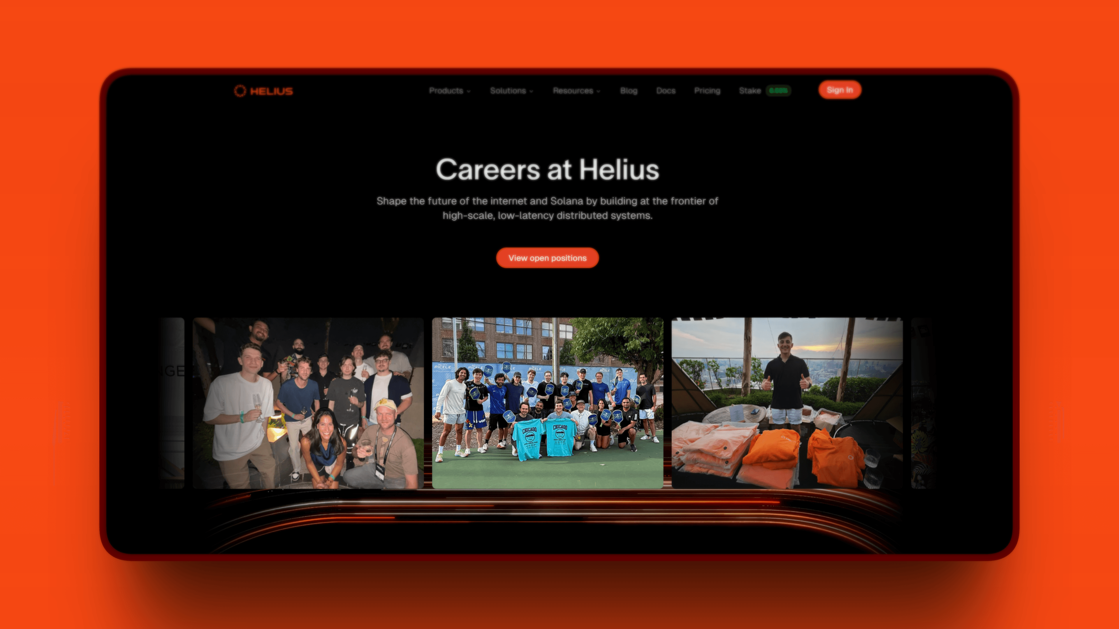
We needed a careers page that reflected our culture: fast-moving and ambitious.
I outlined the structure and copy in Notion, got approval, and then designed the page with emphasis on our operating values.
I handed off production-ready designs to our engineer Koen, we QA'd together, and launched in just 2 days.
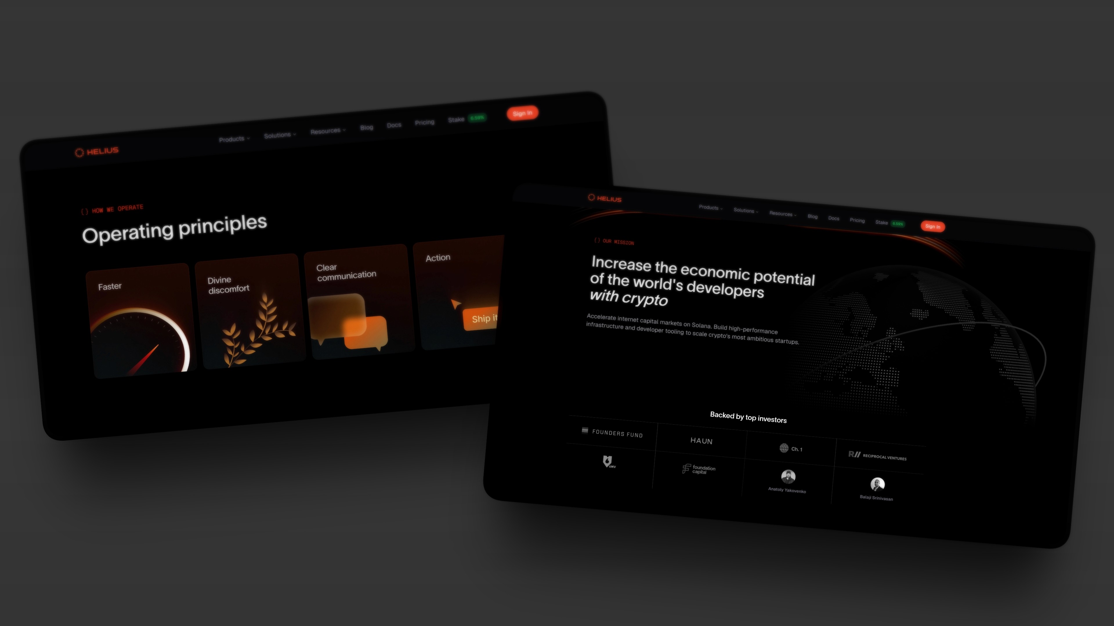
The page helped us attract candidates who aligned with our operating principles.
Animations
To elevate Helius's brand presence and make complex infrastructure concepts more accessible, I designed a series of custom Rive animations for the website.
Crypto infrastructure is inherently technical and abstract.
Developers understand what RPC nodes and blockchain data do, but static graphics don't convey the speed and reliability that make Helius different. We needed motion that felt both premium and purposeful—not gratuitous animation, but movement that actually communicated product value.
Fun fact:
This was my first time working in Rive. I jumped right in and learned along the way and completed multiple animations in a single afternoon.
Orb support
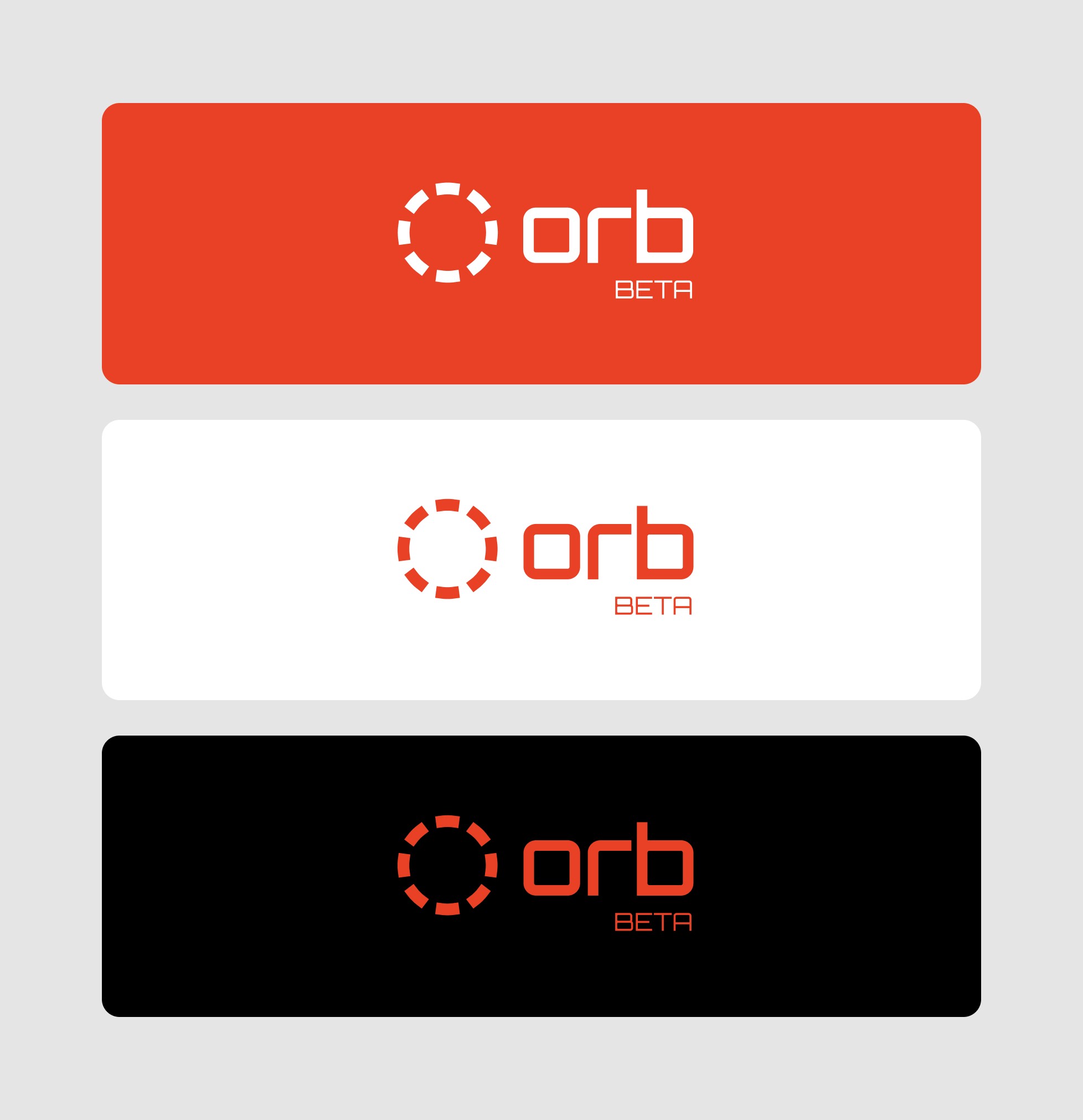
Beyond the dev portal and website, I provided design support for Orb, Helius's Solana blockchain explorer.
Orb has since become the default explorer on Phantom and Coinbase.
My involvement:
I designed the Orb logo to give the product its own identity
Made UI improvements to key areas such as filtering
Served as a design advisor to the engineering team
This was primarily strategic contributions where design support was most needed.
The design agency Airfoil did the bulk of the work on the explorer itself. Go check them out!
Collaboration
Helius moves fast. The working style was autonomous, intense, and rewarding—you had the freedom to make decisions and the responsibility to ship quality work quickly.
As the sole designer across the website, developer portal, and advisor on the blockchain explorer, the scope was demanding but incredibly rewarding.
I collaborated most closely with the dev portal team on billing flows, where the technical complexity and customer impact were highest.
The environment pushed me to work faster and smarter than I had before.