Overview
Client: Calendly is a $3 billion scheduling platform that makes coordinating availability easy. They're trusted by over 10 million users and 100,000+ companies.
Industry: SaaS (B2B & B2C)
Timeline: 3 months for the initial launch, followed by a retainer from 2022 to 2023.
My Role: Sole designer. This was during my tenure as a Sr. Designer at Webstacks.
Tools: Figma, Adobe Creative Cloud, Dato CMS, Optimizely
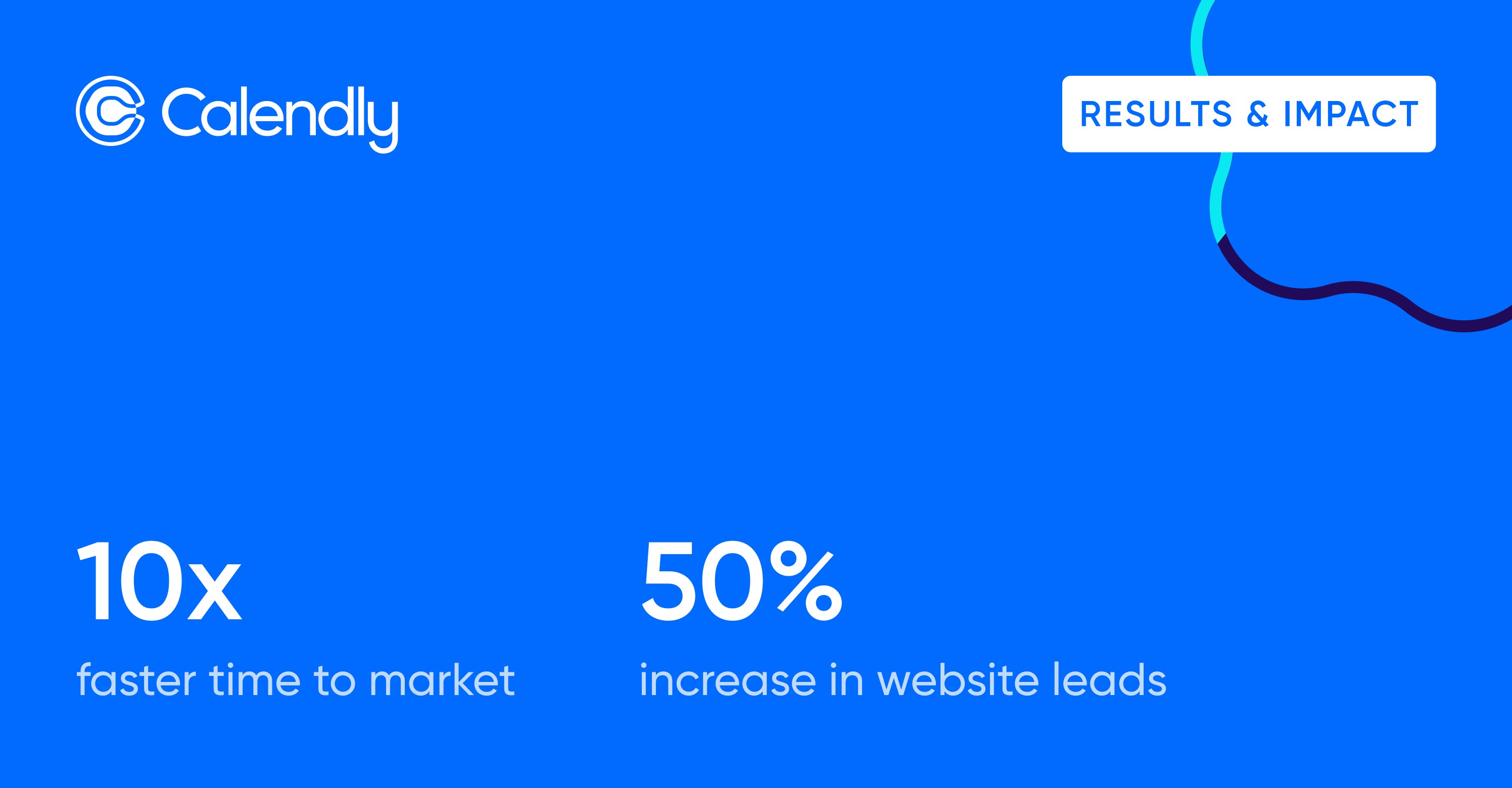
Results
10x faster time to market
50% increase in website leads
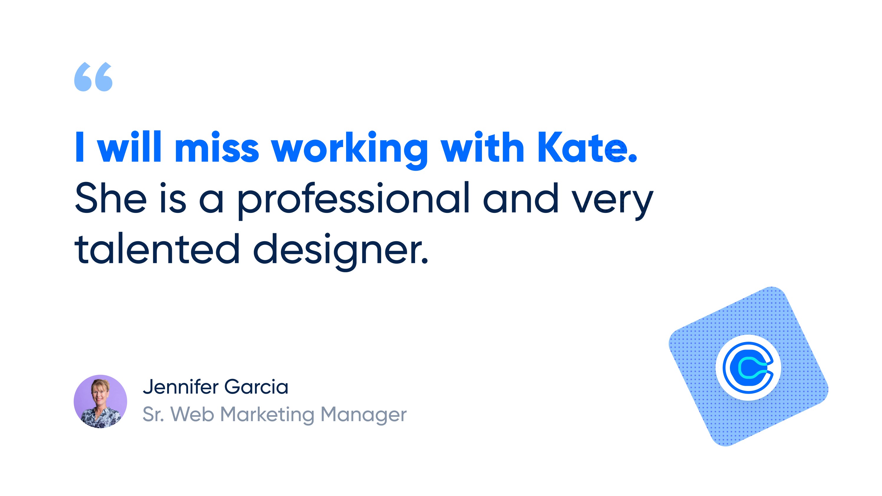
Special thanks: This was successful in large part due to Jennifer Garcia, who is an incredible marketer, Daniel Slovinsky for his outstanding development work, and Nic Mansfield for his design mentorship.
Challenge
Our agency was brought on to solve:
Website shortcomings that didn't move the needle targeting enterprises
Visual disconnect that didn't portray their product sophistication
Slow website workflows between marketing, sales, and design
With 30,000+ daily visitors experiencing this misalignment, Calendly needed to move quickly to serve a website that represented their values and performed better.
Resolution
In three months, we:
Launched performant pages and website improvements to attract enterprises
Sped up workflows 10x via a design system and a headless CMS
Scaled and matured their brand identity
By prioritizing performance and personalization, our teams created a site that converts enterprise customers.
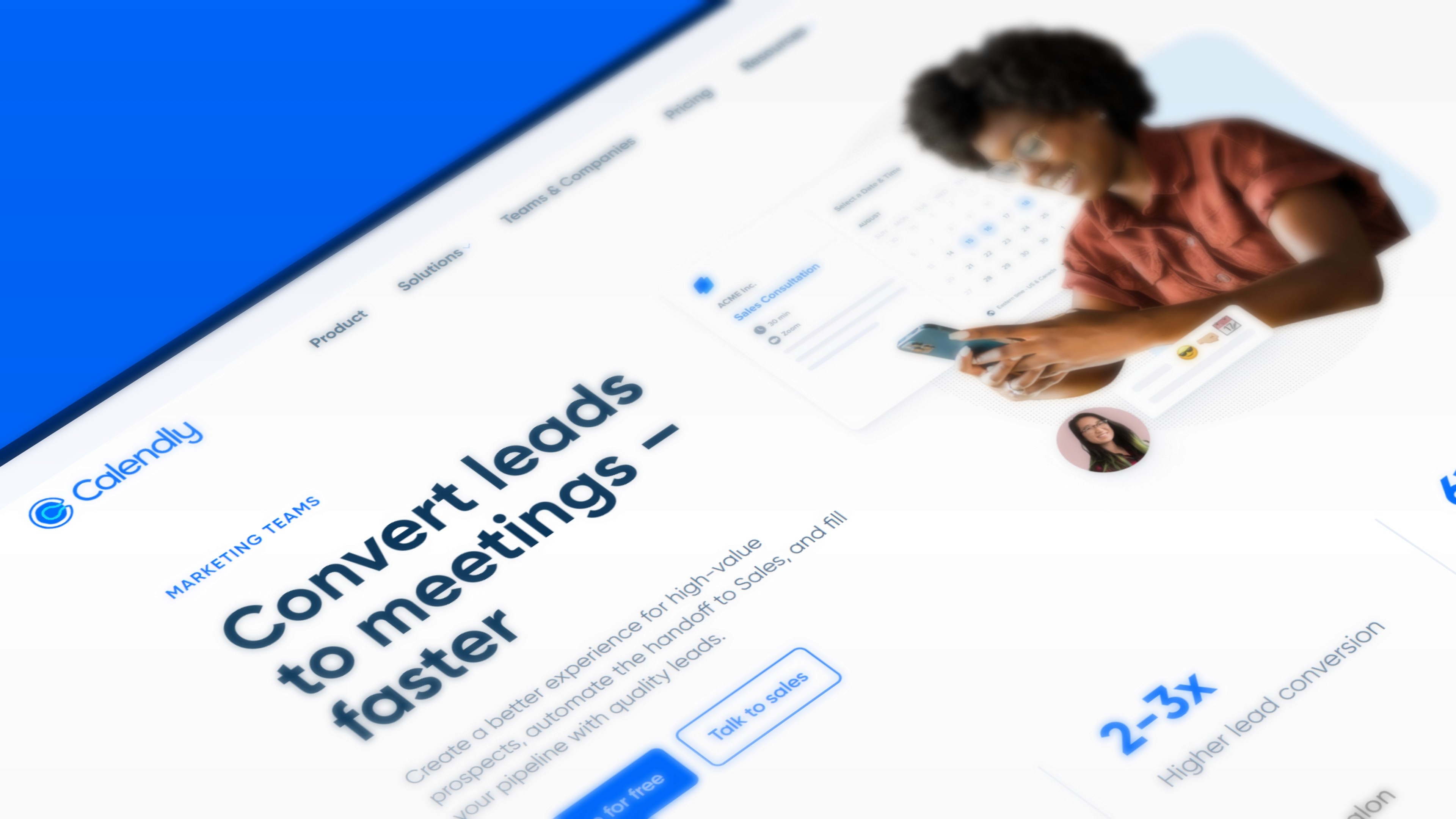
Enterprise efforts
We redesigned the Enterprise page to send a clear signal: Calendly isn't just for solo users; it's built for serious organizations.
The page was designed around what Enterprises care about the most:
Security
Scalability
Admin controls
We integrated Clearbit for lead scoring and Marketo to route qualified prospects directly to account executives, ensuring the website generated quality leads that moved deals forward.
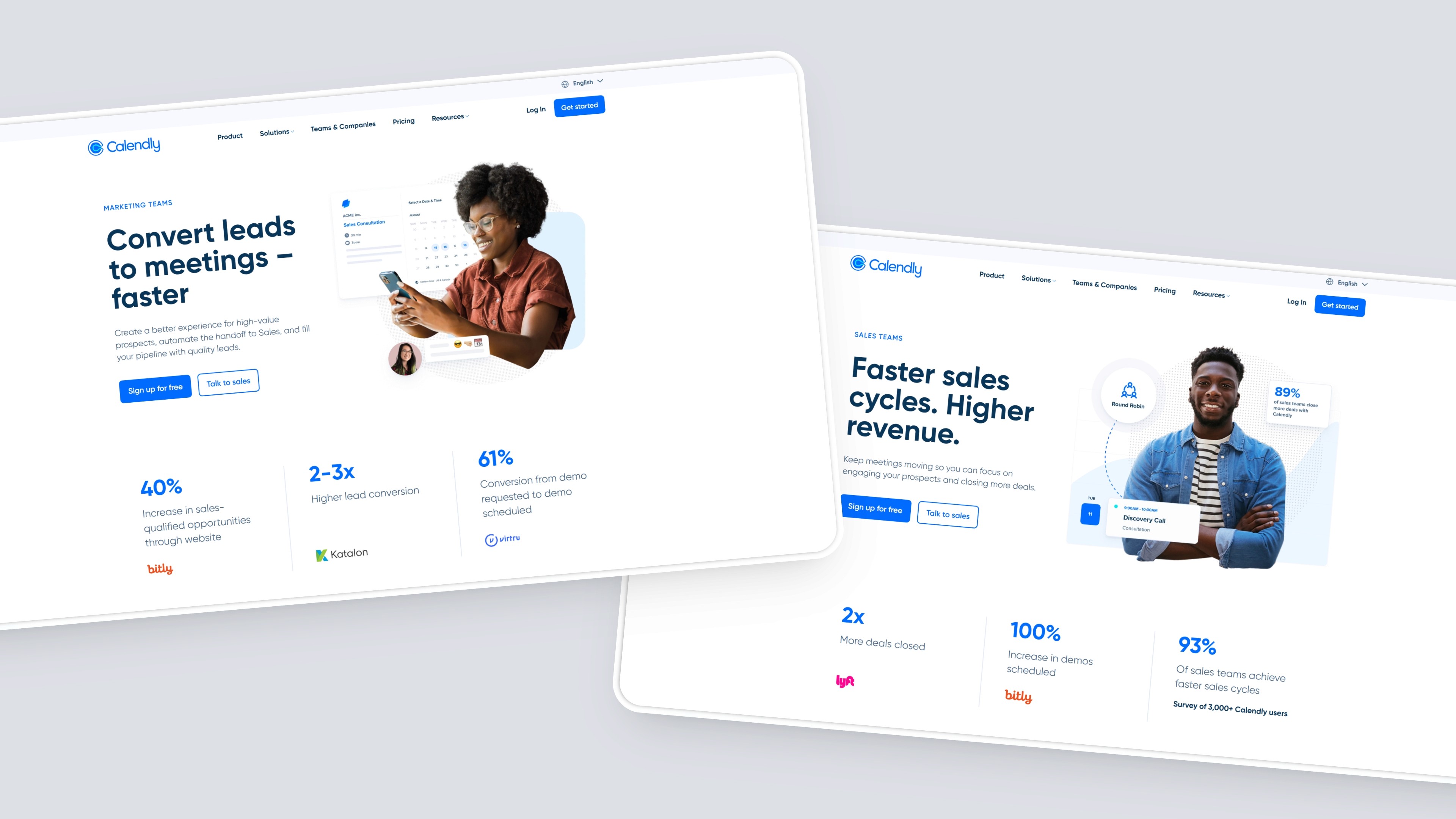
Solutions pages
By introducing a Solutions addition to our architecture, users quickly found tailored content to specific roles.
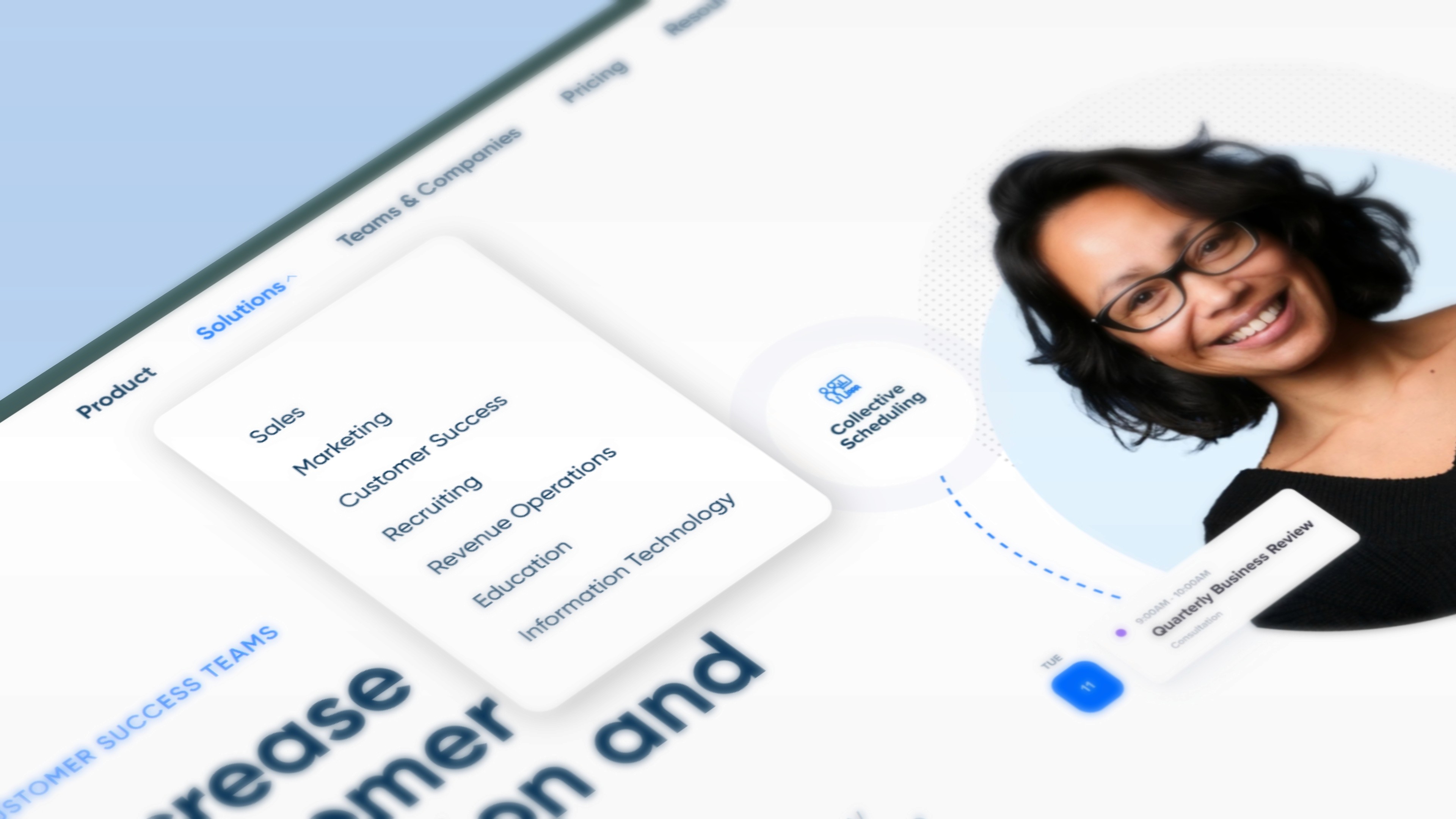
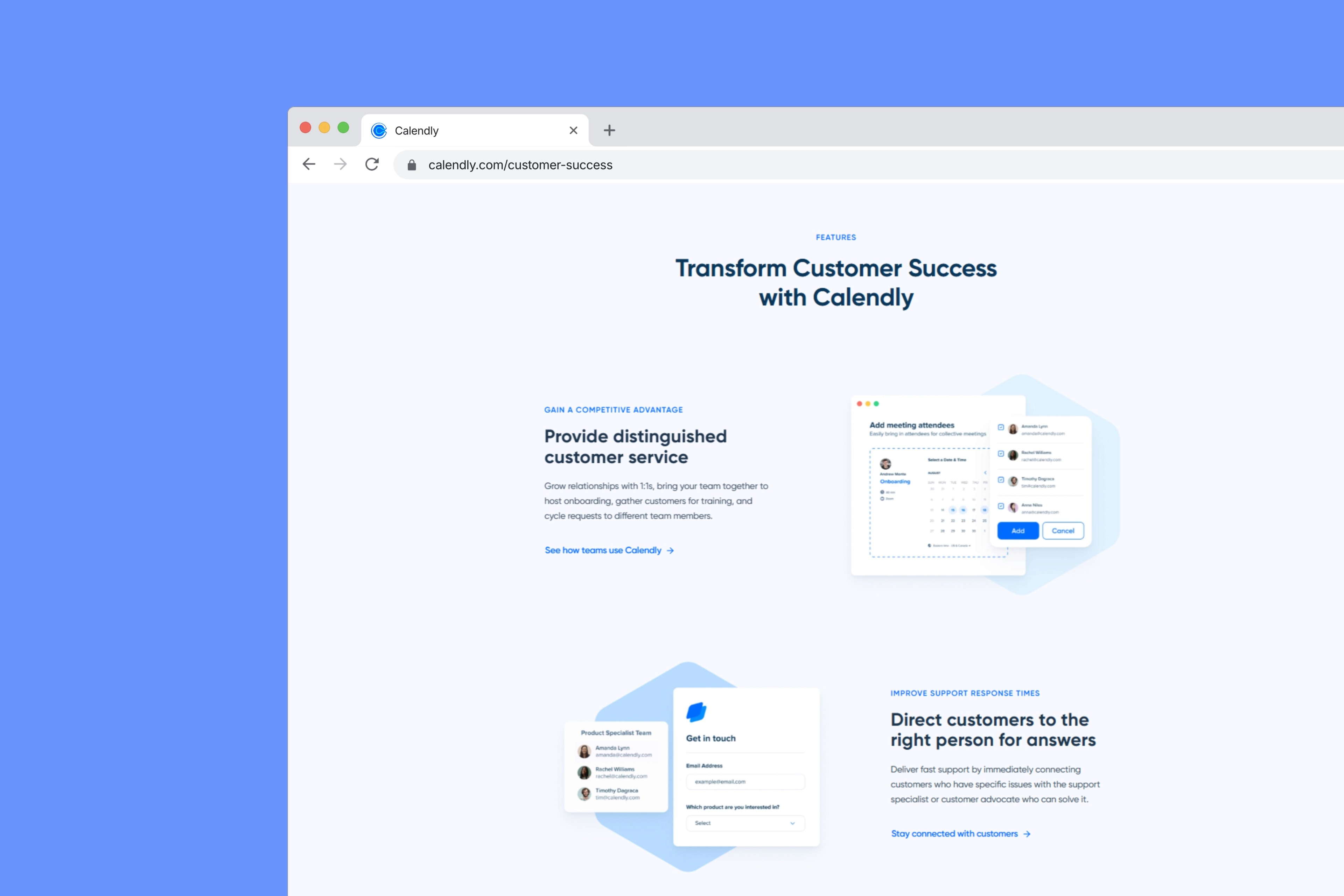
By designing distinct solution pages for each persona, we could tailor messaging, feature prioritization, and social proof to resonate with our customers' specific workflows and pain points.
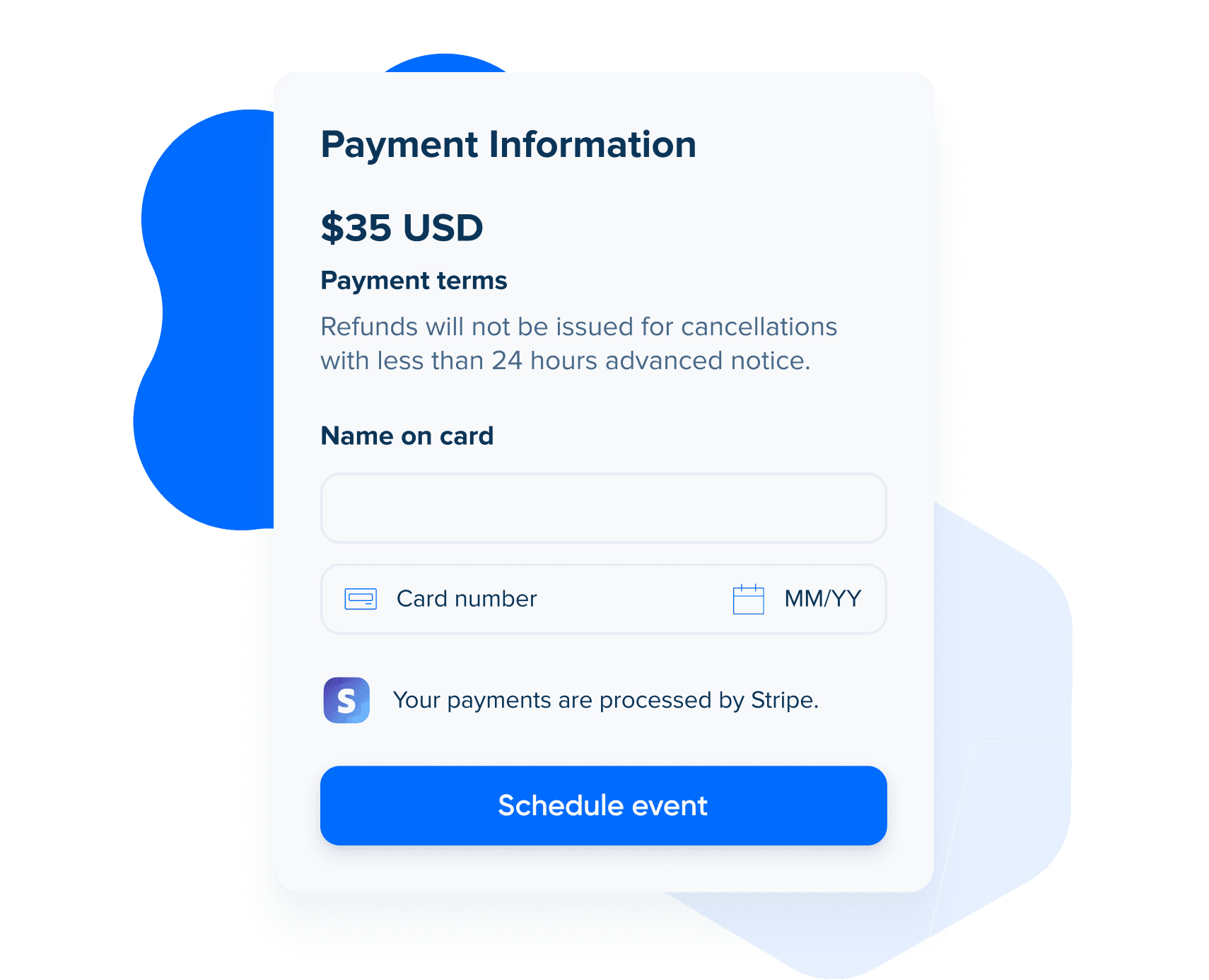
Pricing page
Our pricing page struck a balance between transparency and flexibility for custom pricing.
Introducing a starting price point and highlighting expanded capabilities means we can provide prospects with enough information to self-qualify while leaving room for sales conversations.
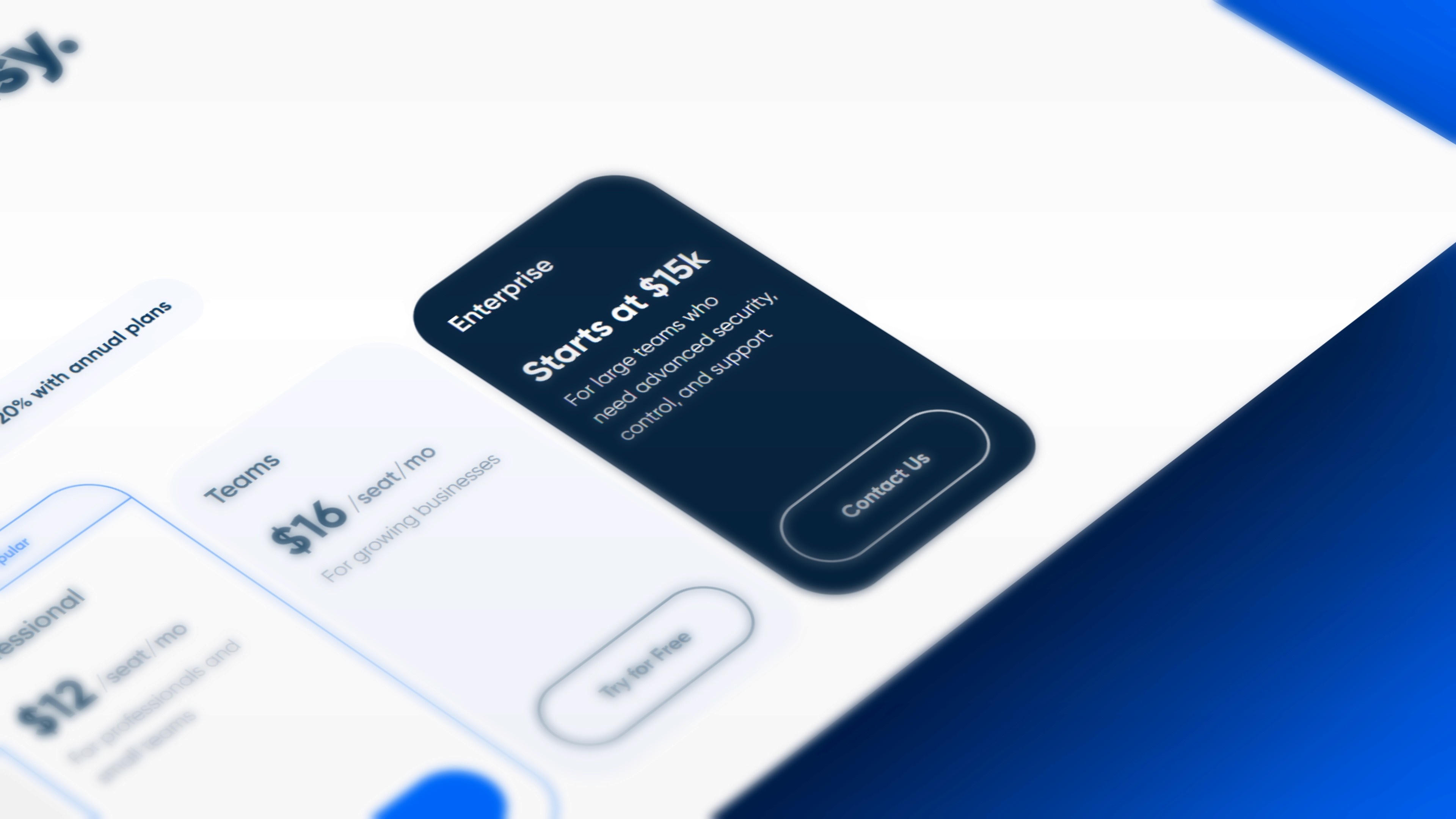
I designed the comparison table to surface the most relevant features based on common decision criteria, such as team size, scheduling complexity, and integration needs, so users can quickly identify their fit without an overwhelming feature list.
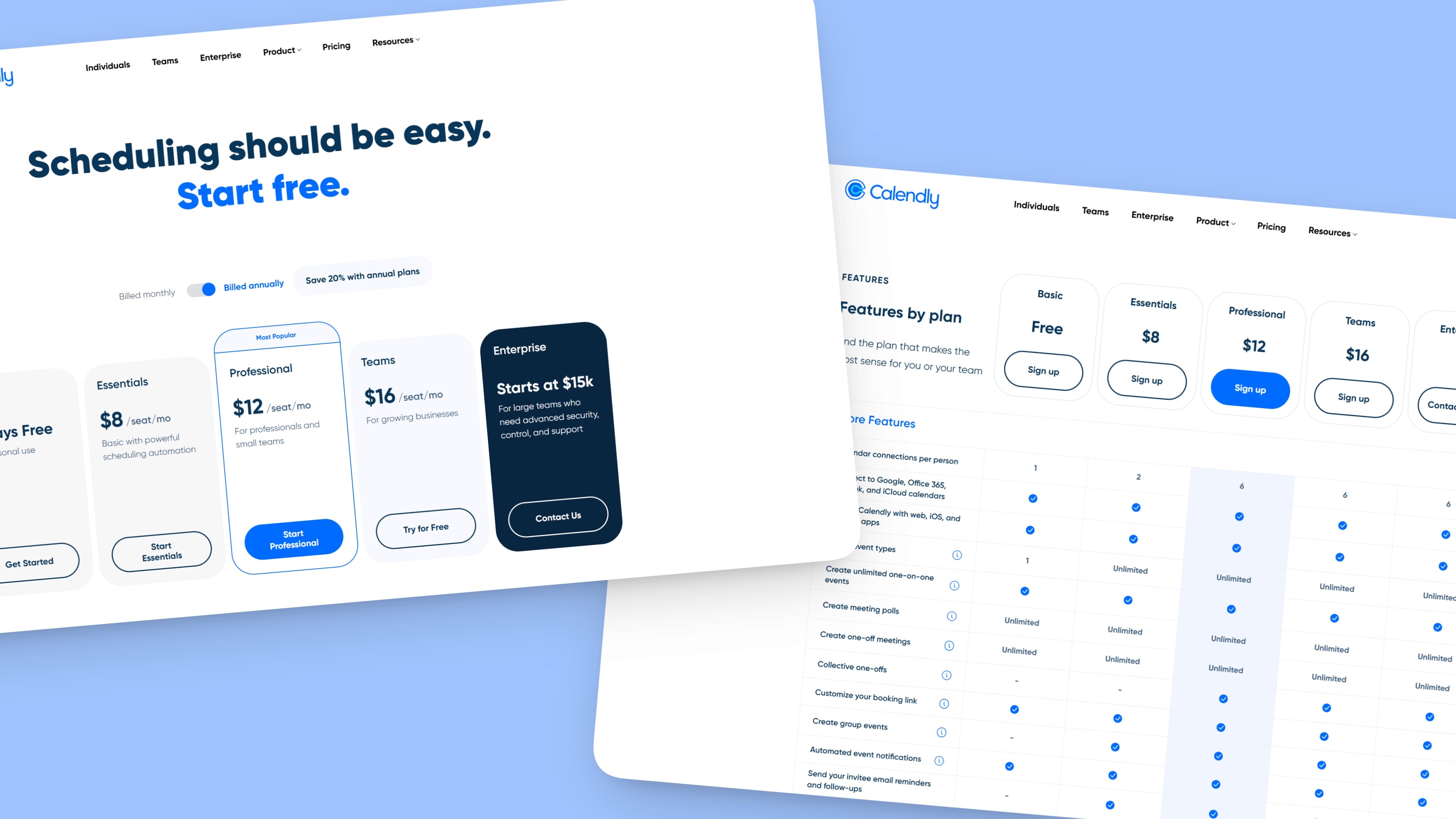
One thing I would have done differently: I would have surfaced the top features directly in the cards themselves via bullet points, so critical decision-making information was above the fold.
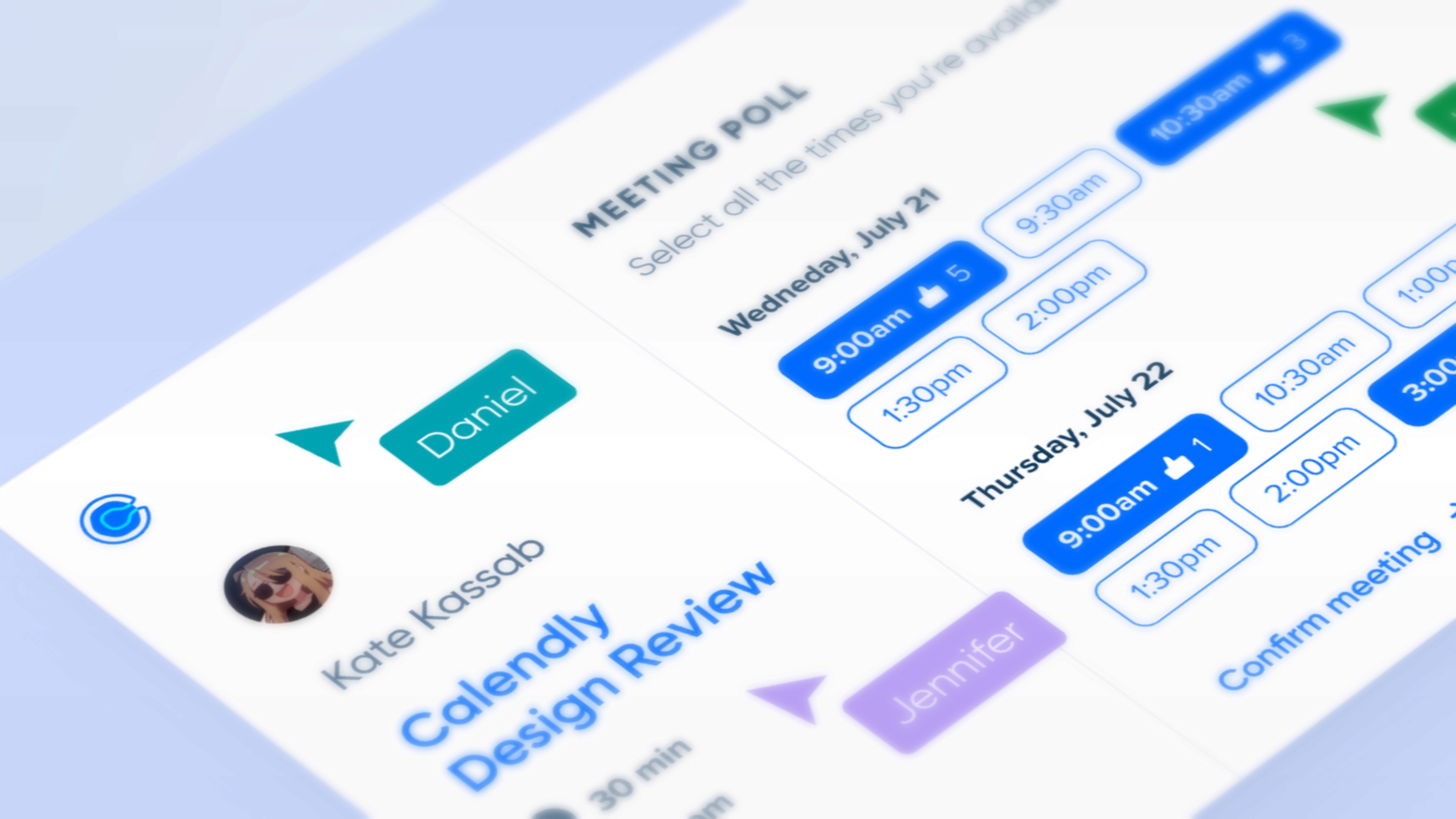
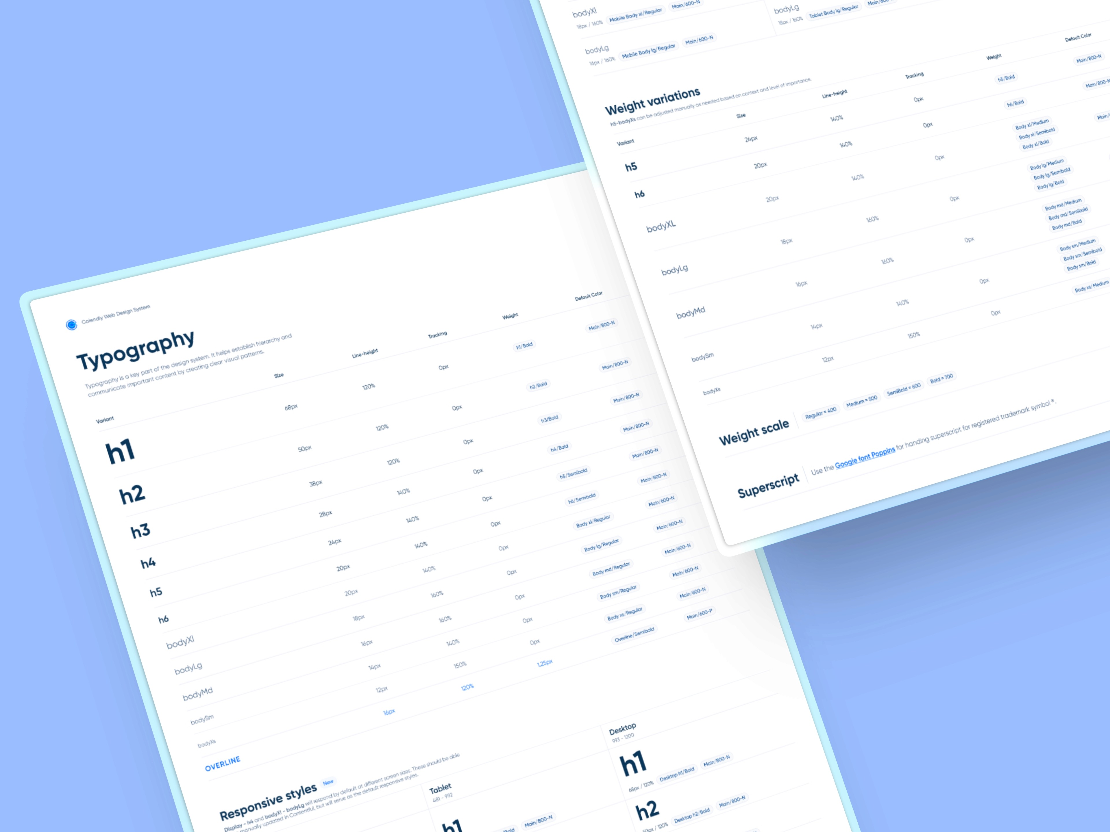
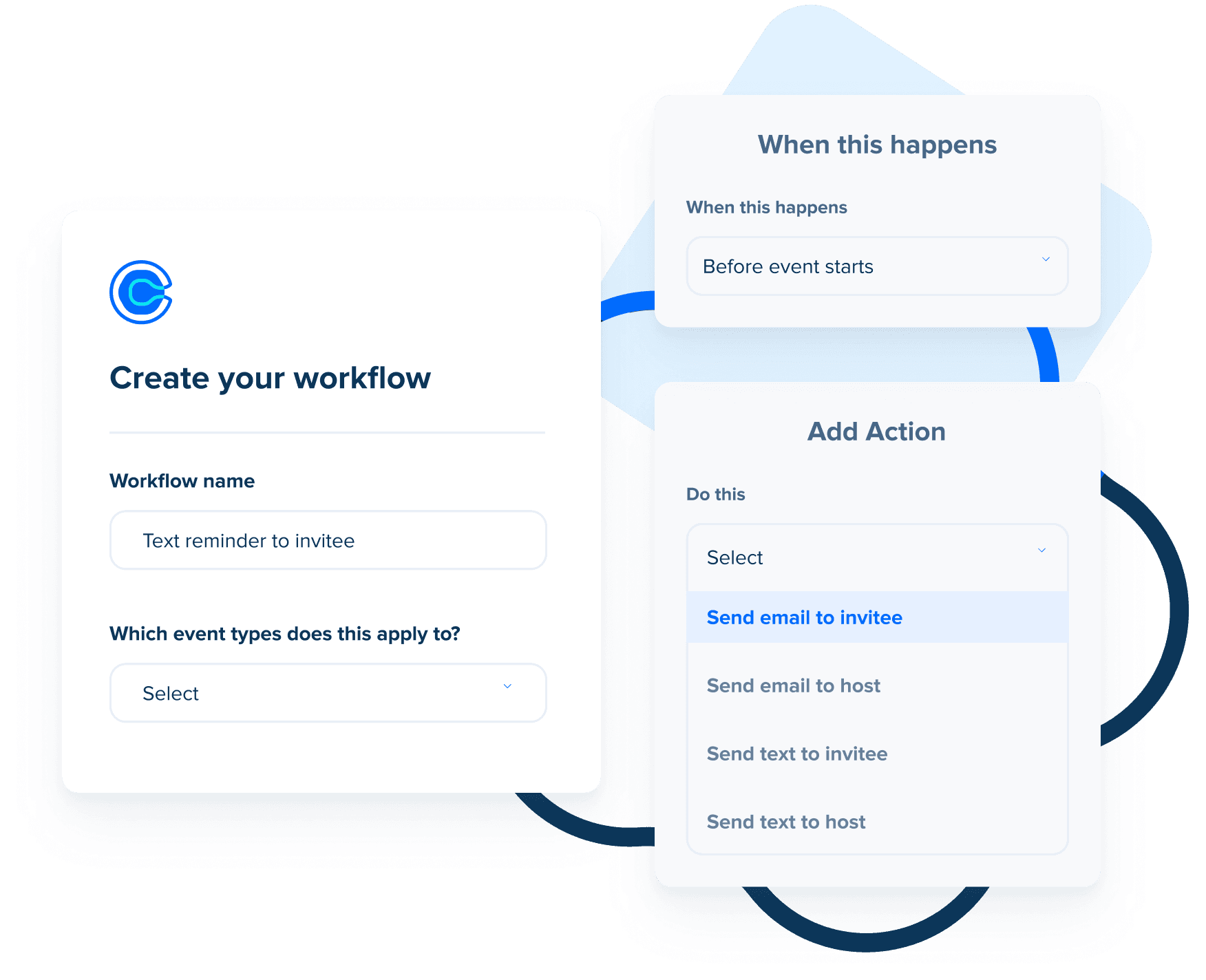
Design system
Working with Calendly brought the opportunity to establish their design system from the ground up,

I used the Atomic Design methodology as the framework for their UI library, starting from foundational elements and building up to complete page templates. Every component was designed mobile-first, with breakpoints documented to ensure seamless experiences across devices.
All components met WCAG 2.1 AA standards, ensuring accessibility for enterprise users with diverse needs.
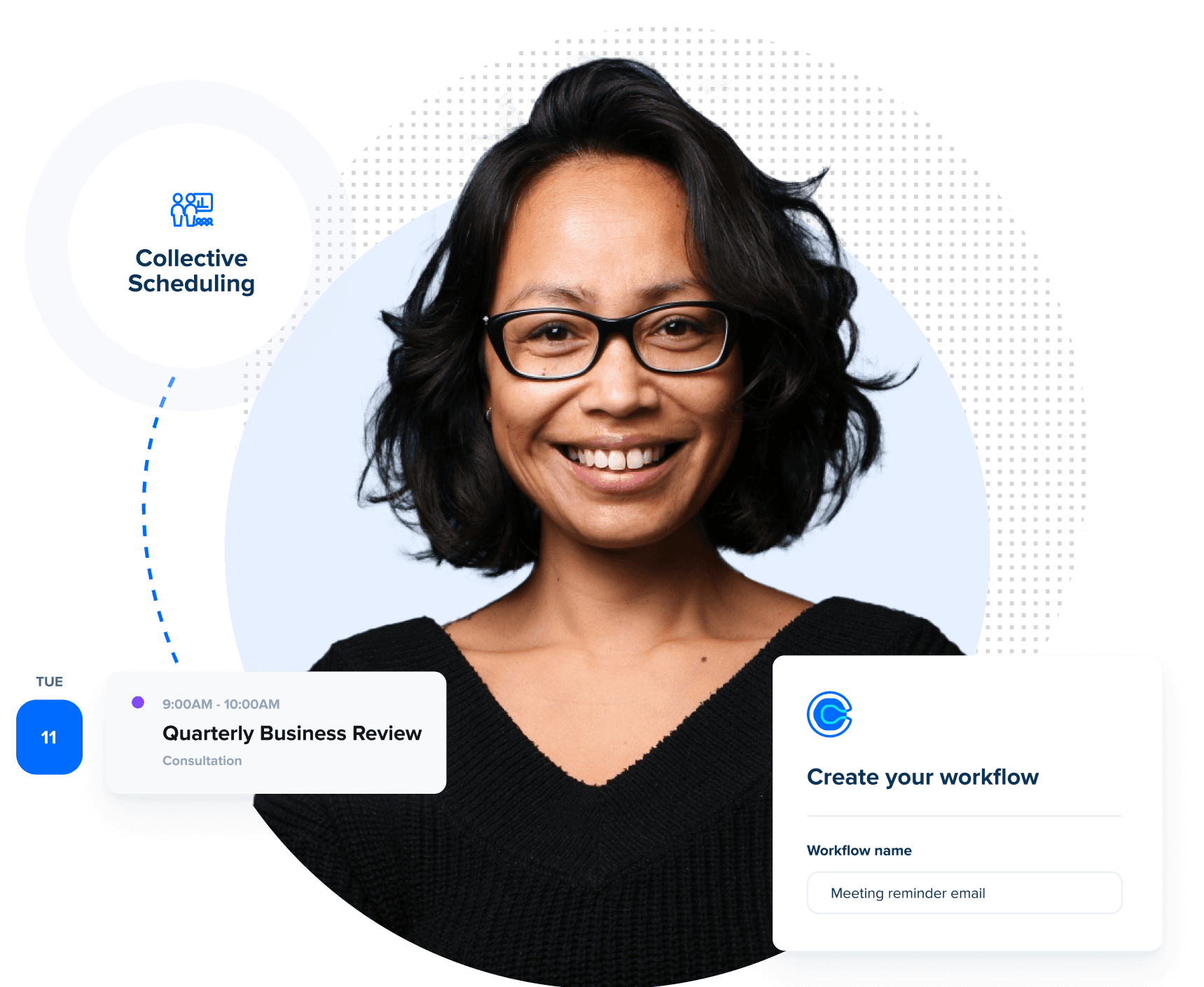
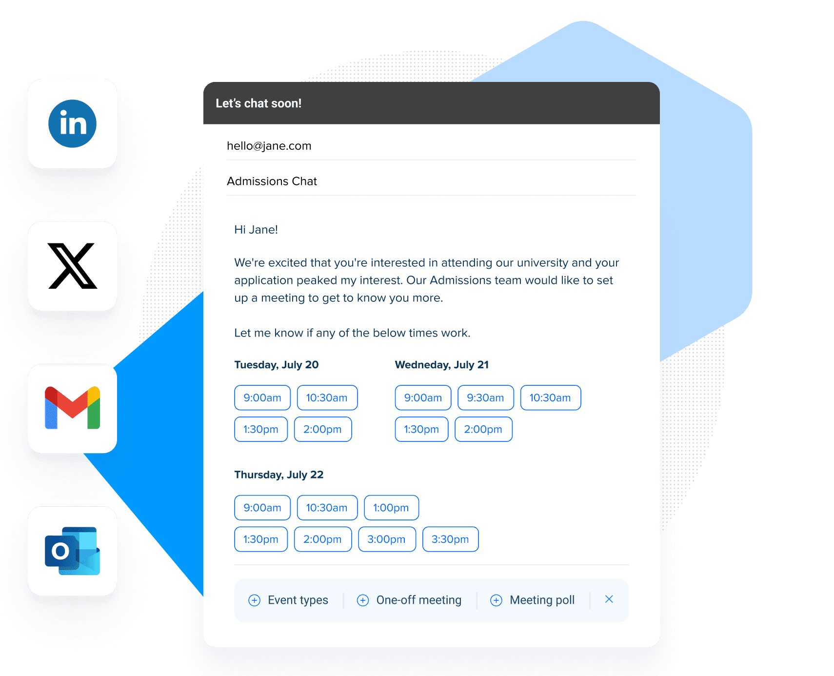
Illustrations

During my time working with Calendly, I created 100+ illustrations.
This spanned from abstracted product examples to more human-centric visuals.
Fun fact: I once blazed through 40+ in one night (such is the fun of agency life :D )
Localization
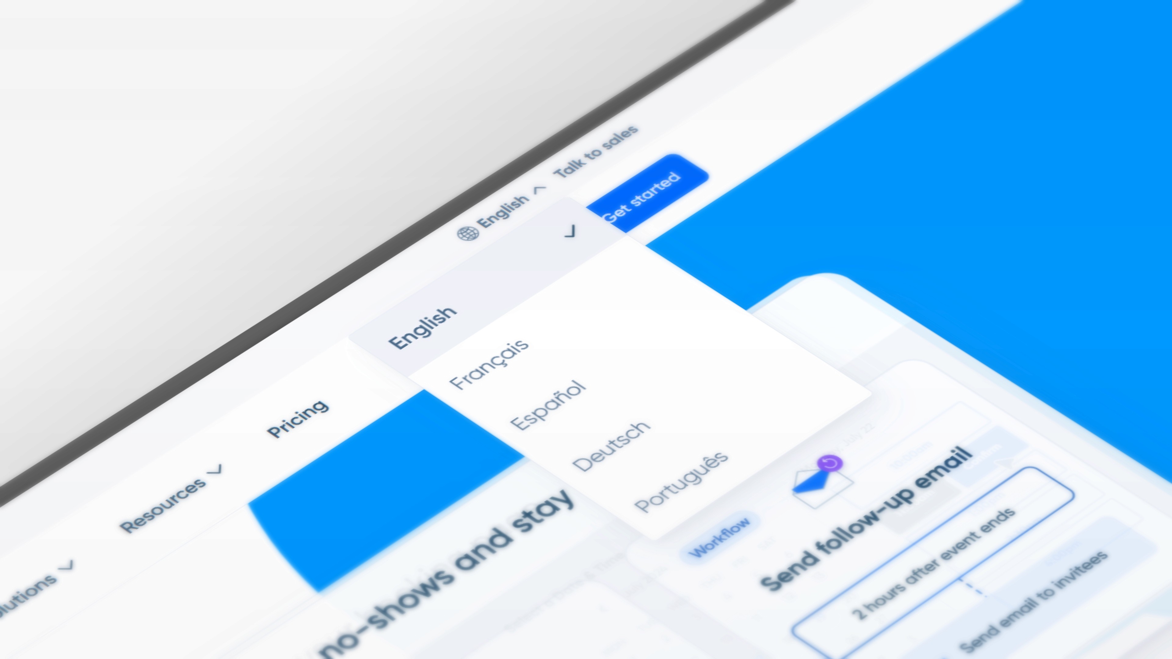
I built localization into Calendly's design system to support five languages: English, French, Spanish, Dutch, and Portuguese.
This meant designing flexible components that could handle text expansion (Spanish can run 30% longer than English), ensuring layouts gracefully accommodated longer translations without breaking.
A/B testing
We used Optimizely to validate design decisions across high-traffic pages, testing CTA copy, headlines, illustration styles, and form lengths. This helped us understand what resonated with enterprise buyers versus individual users.
Key learnings:
Outcome-based headlines like "Save 10+ hours per week" outperformed feature-focused messaging by 23%.
Enterprise buyers preferred longer qualification forms while individual users dropped off, so we tailored form lengths by audience segment.
Illustration tests revealed that abstract styles worked well for homepage appeal, but enterprise pages converted better with realistic UI mockups that showed actual product capabilities.
Collaboration
Daily standups kept design, dev, and Calendly's marketing aligned while two-week sprints gave us rhythm.
Asana tickets tracked everything from review to dev handoff, with prioritization sessions deciding what shipped next. Informal communication was captured in our shared Slack channel.
I feel very fortunate to have worked with such an incredible team.